# Introduction
URL: /
undefined
***
title: Introduction
icon: Album
-----------
import Image from "next/image"
`@daveyplate/better-auth-ui` provides ready-to-use shadcn/ui styled components for rapidly implementing authentication features in your Next.js and React applications, seamlessly integrating with [`better-auth`](https://better-auth.com).
## Why choose Better Auth UI?
* **Easy** – Plug & play authentication components.
* **Customizable** – Fully styled with TailwindCSS and shadcn/ui, easy to extend to your needs.
* **Robust** – Made with modern best practices, built to work seamlessly with existing React projects.
## Key Features
* Fully Responsive UI components
* TailwindCSS and shadcn/ui styling support
* First-class integration with [`better-auth`](https://better-auth.com)
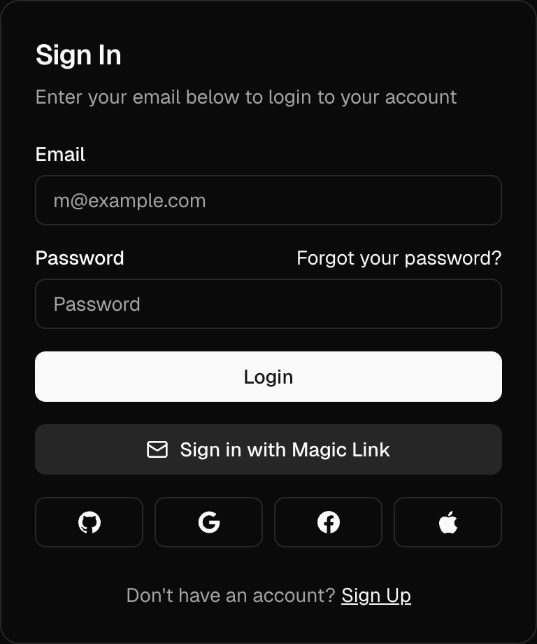
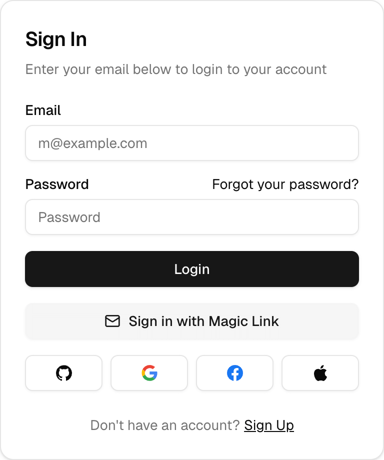
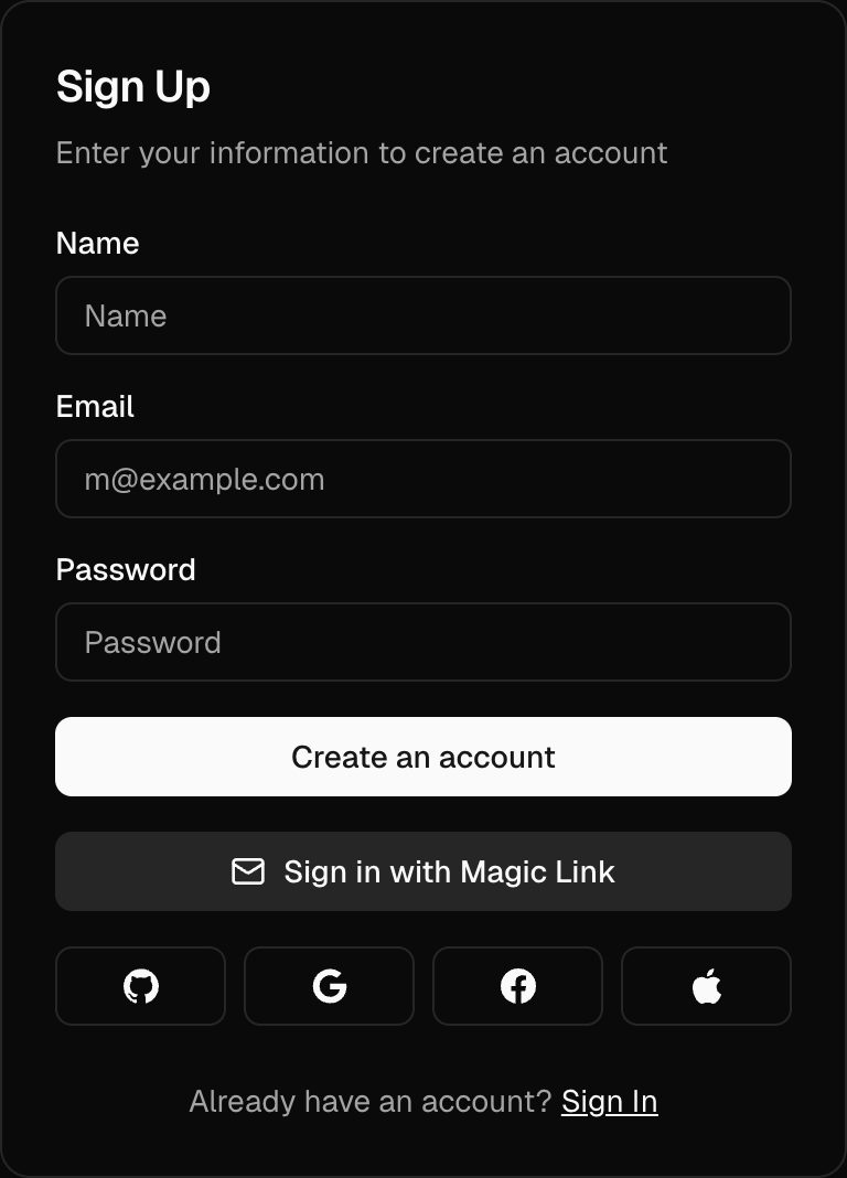
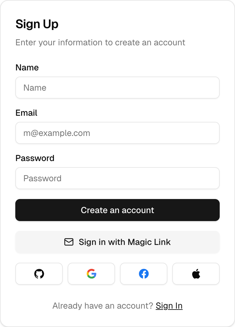
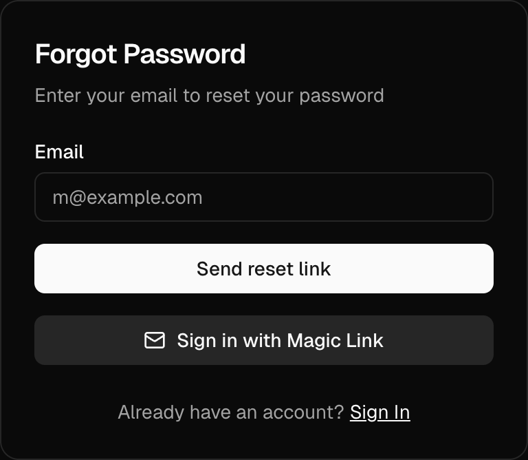
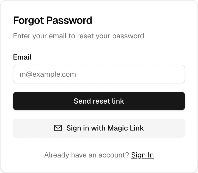
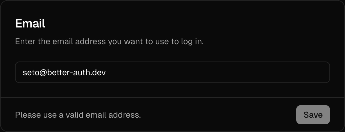
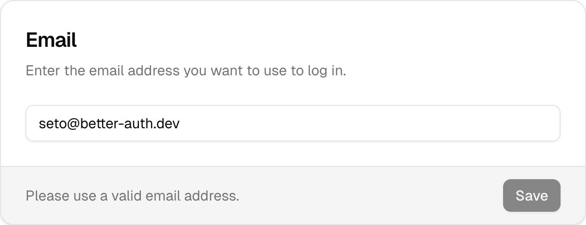
## Screenshots
Below are examples of the components provided by `@daveyplate/better-auth-ui`.
## Next Steps
Before starting the installation, please ensure you have everything that's required to integrate `@daveyplate/better-auth-ui` seamlessly.
* [Requirements](/getting-started/requirements)
* [Installation](/getting-started/installation)
## LLMS.txt
Better Auth UI provides an LLMs.txt file that helps AI models understand how to interact with your auth UI. You can find it at [https://better-auth-ui.com/llms.txt](https://better-auth-ui.com/llms.txt).
# Additional Fields
URL: /advanced/additional-fields
undefined
***
title: Additional Fields
icon: UserPen
-------------
## Advanced Configuration
### Create Custom Authentication Flow
You may use `additionalFields` to define extra fields required during signup or settings:
```tsx
parseInt(value) >= 18
}
}}
settings={{
fields: ["company", "age"]
}}
signUp={{
fields: ["company", "age"]
}}
>
{children}
```
# API Keys
URL: /advanced/api-keys
undefined
***
title: API Keys
icon: Key
---------
API Keys provide a secure way for applications and services to authenticate with your API programmatically. Better Auth UI includes a complete API key management system with creation, expiration, and revocation capabilities.
## Overview
The API key system provides:
* **Secure Generation**: Cryptographically secure key generation
* **Expiration Management**: Set expiration dates for keys
* **Custom Prefixes**: Add custom prefixes to identify key types
* **Metadata Support**: Attach metadata to keys for tracking
* **One-Time Display**: Keys are shown only once after creation
* **Secure Storage**: Keys are hashed before storage
## Enabling API Keys
To enable API keys, configure the `apiKey` prop in your `AuthUIProvider`:
```tsx title="providers.tsx"
{children}
```
### Advanced Configuration
```tsx title="providers.tsx"
{children}
```
## Key Components
### ApiKeysCard
The main component for managing API keys:
```tsx
import { ApiKeysCard } from '@daveyplate/better-auth-ui'
```
### In SettingsCards
API keys automatically appear in settings when enabled:
```tsx
import { SettingsCards } from '@daveyplate/better-auth-ui'
// Shows API keys management when view="API_KEYS"
```
## API Key Structure
Generated API keys follow this structure:
```
[prefix][random_string]
```
Example: `app_sk_live_a1b2c3d4e5f6g7h8i9j0`
## Using API Keys
### Client-Side Generation
```tsx
const { authClient } = useContext(AuthUIContext)
// Create a new API key
const { key } = await authClient.apiKey.create({
name: "Production API Key",
expiresIn: 30 * 24 * 60 * 60, // 30 days in seconds
prefix: "prod_",
metadata: {
service: "payment-processor"
}
})
console.log(key) // This is the only time you'll see the full key
```
### Server-Side Validation
```ts
// In your API endpoint
import { auth } from '@/lib/auth'
export async function POST(request: Request) {
const apiKey = request.headers.get('x-api-key')
if (!apiKey) {
return new Response('API key required', { status: 401 })
}
const session = await auth.api.validateApiKey({
apiKey
})
if (!session) {
return new Response('Invalid API key', { status: 401 })
}
// Access user and metadata
console.log(session.user)
console.log(session.apiKey.metadata)
// Process request...
}
```
## Security Features
### One-Time Display
* Keys are shown in full only once after creation
* Users must copy the key immediately
* Lost keys cannot be recovered
### Secure Storage
* Keys are hashed using bcrypt before storage
* Original keys are never stored in the database
* Only the first few characters are stored for identification
### Expiration
* Keys can have expiration dates
* Expired keys are automatically rejected
* No expiration option available for long-lived keys
## Best Practices
1. **Naming Convention**
```
"Production - Payment Service"
"Development - Local Testing"
"CI/CD - GitHub Actions"
```
2. **Expiration Policy**
* Development keys: 7-30 days
* Production keys: 90-365 days
* CI/CD keys: No expiration with rotation
3. **Key Rotation**
* Rotate production keys every 90 days
* Implement overlap period for smooth transition
* Log key usage for audit trails
4. **Access Control**
* Limit who can create API keys
* Log all key operations
* Monitor key usage patterns
5. **Environment Separation**
```tsx
apiKey={{
prefix: process.env.NODE_ENV === 'production' ? 'pk_' : 'sk_test_'
}}
```
## Metadata Usage
Attach metadata to track key usage:
```tsx
await authClient.apiKey.create({
name: "Analytics Service",
metadata: {
service: "analytics",
environment: "production",
permissions: ["read:analytics", "write:reports"],
rateLimit: 1000
}
})
```
## Rate Limiting
Implement rate limiting based on metadata:
```ts
// Server-side
const session = await auth.api.validateApiKey({ apiKey })
const rateLimit = session.apiKey.metadata.rateLimit || 100
// Apply rate limiting logic
```
## Monitoring
Track API key usage:
1. **Usage Metrics**: Track requests per key
2. **Error Rates**: Monitor failed authentications
3. **Expiration Alerts**: Notify before keys expire
4. **Anomaly Detection**: Detect unusual usage patterns
## Error Handling
Common API key errors:
* `API_KEY_INVALID`: Key doesn't exist or is malformed
* `API_KEY_EXPIRED`: Key has passed expiration date
* `API_KEY_REVOKED`: Key has been manually revoked
* `API_KEY_RATE_LIMITED`: Key has exceeded rate limits
# Custom Auth Paths
URL: /advanced/custom-auth-paths
undefined
***
title: Custom Auth Paths
icon: Route
-----------
Here's a complete guide on how to customize view paths using the `AuthUIProvider` component. This example will show you how to change the auth routes from `/auth/sign-in` and `/auth/sign-out` to use custom paths such as `/auth/login` and `/auth/logout`, respectively.
### Step 1: Customize Auth View Paths
First, customize the default built-in paths by providing your custom routes through the `viewPaths` prop on the `` component.
```tsx
"use client"
import { AuthUIProvider } from "@daveyplate/better-auth-ui"
import { authClient } from "@/lib/auth-client"
import { useRouter } from "next/navigation"
import Link from "next/link"
export function Providers({ children }: { children: React.ReactNode }) {
const router = useRouter()
return (
router.refresh()}
Link={Link}
viewPaths={{
SIGN_IN: "login",
SIGN_OUT: "logout",
SIGN_UP: "register",
FORGOT_PASSWORD: "forgot",
RESET_PASSWORD: "reset",
MAGIC_LINK: "magic",
SETTINGS: "config"
}}
>
{children}
)
}
```
Now your newly configured `viewPaths` object is as follows:
| Default Path | Custom Path |
| ----------------------- | ---------------- |
| `/auth/sign-in` | `/auth/login` |
| `/auth/sign-out` | `/auth/logout` |
| `/auth/sign-up` | `/auth/register` |
| `/auth/forgot-password` | `/auth/forgot` |
| `/auth/reset-password` | `/auth/reset` |
| `/auth/magic-link` | `/auth/magic` |
| `/auth/settings` | `/auth/config` |
## Adjusting Dynamic Auth Route
Next, your authentication page route can dynamically handle these paths. Set up your dynamic authentication page based on these custom routes.
Using Next.js App Router (`app` router):
```tsx
import { AuthCard } from "@daveyplate/better-auth-ui"
import { authViewPaths } from "@daveyplate/better-auth-ui/server"
export function generateStaticParams() {
return Object.values({
...authViewPaths,
SIGN_IN: "login",
SIGN_OUT: "logout",
SIGN_UP: "register",
FORGOT_PASSWORD: "forgot",
RESET_PASSWORD: "reset",
MAGIC_LINK: "magic",
SETTINGS: "config"
}).map((pathname) => ({ pathname }))
}
export default async function AuthPage({ params }: { params: Promise<{ pathname: string }> }) {
const { pathname } = await params
return (
)
}
```
### Example usage across your app:
#### Linking to new auth views:
```tsx
import Link from "next/link"
export default function Navbar() {
return (
)
}
```
### Summary of Steps (Recap):
* Defined custom view paths within `AuthUIProvider`.
* Updated dynamic auth page to handle correct paths within `generateStaticParams`.
* Revised links/apps accordingly to use your newly specified paths.
You have now successfully customized all your authentication URLs using the shipped customization options while preserving all the other features and integrations seamlessly.
# Custom Settings
URL: /advanced/custom-settings
undefined
***
title: Custom Settings
icon: Cog
---------
The default authentication components provided by `@daveyplate/better-auth-ui` include built-in settings pages accessible under the same base path as your auth views (e.g., `/auth/settings`, `/auth/security`, etc.).
However, for advanced use cases, you may want to:
1. Move the built-in settings views to a different base path (using `settings.basePath`)
2. Replace the settings with a completely custom implementation (using `settings.url`)
3. Build your own settings page using individual components
## Overview
You have three primary ways to customize the settings experience:
1. **Move settings to a different path**: Use `settings.basePath` to relocate all built-in settings views while keeping their functionality
2. **Replace with custom settings**: Use `settings.url` to redirect to your completely custom settings implementation
3. **Build custom layouts**: Import individual settings components to create your own layouts
### Quick Comparison
| Option | Use Case | Configuration | Result |
| --------------------- | ------------------------------------------------- | -------------------------------------- | -------------------------------------------------------------- |
| `settings.basePath` | Keep built-in settings but move to different path | `settings: { basePath: "/dashboard" }` | Settings at `/dashboard/settings`, `/dashboard/security`, etc. |
| `settings.url` | Replace with completely custom settings | `settings: { url: "/my-settings" }` | All settings routes redirect to `/my-settings` |
| Individual components | Build custom layouts with specific components | Import components directly | Full control over layout and functionality |
## Option 1: Moving Settings to a Different Base Path
If you want to keep the built-in settings functionality but move it to a different location (e.g., from `/auth/settings` to `/dashboard/settings`), use the `settings.basePath` option:
```tsx title="app/providers.tsx"
"use client"
import { AuthUIProvider } from "@daveyplate/better-auth-ui"
import { authClient } from "@/lib/auth-client"
import { useRouter } from "next/navigation"
import Link from "next/link"
export function Providers({ children }: { children: React.ReactNode }) {
const router = useRouter()
return (
router.refresh()}
settings={{
basePath: "/dashboard" // Settings views will be at /dashboard/settings, /dashboard/security, etc.
}}
Link={Link}
>
{children}
)
}
```
With this configuration:
* Auth views remain at: `/auth/sign-in`, `/auth/sign-up`, etc.
* Settings views move to: `/dashboard/settings`, `/dashboard/security`, `/dashboard/api-keys`, `/dashboard/organization`, etc.
* The `` and `` components automatically use the new base path
You can combine `basePath` with other settings options:
```tsx
settings={{
basePath: "/dashboard",
fields: ["image", "name", "age"] // Specify which fields to show
}}
```
### Using SettingsCards with pathname
When using `settings.basePath`, you can pass the `pathname` prop to `` to automatically determine the current view:
```tsx title="app/dashboard/[...settings]/page.tsx"
import { SettingsCards } from "@daveyplate/better-auth-ui"
export default function SettingsPage({
params
}: {
params: { settings: string[] }
}) {
const pathname = `/dashboard/${params.settings?.join("/") || "settings"}`
return (
)
}
```
## Option 2: Completely Custom Settings Page
To replace the built-in settings with your own custom implementation, use `settings.url`:
```tsx title="app/providers.tsx"
"use client"
import { AuthUIProvider } from "@daveyplate/better-auth-ui"
import { authClient } from "@/lib/auth-client"
import { useRouter } from "next/navigation"
import Link from "next/link"
export function Providers({ children }: { children: React.ReactNode }) {
const router = useRouter()
return (
router.refresh()}
settings={{
url: "/my-custom-settings" // Redirects to your custom settings page
}}
Link={Link}
>
{children}
)
}
```
> **Important**: When `settings.url` is set, all built-in settings routes will redirect to your custom URL. You're responsible for implementing the entire settings functionality.
## Option 3: Building Custom Settings Layouts
For maximum control, you can build your own settings page layouts using individual components.
### Using Individual Settings Components
The easiest way to get started is using the `` component, which automatically handles displaying all enabled settings. This includes avatar, email, username, password, linked social providers, session management, delete account, and custom additional fields you've provided.
```tsx title="app/dashboard/settings/page.tsx"
import { SettingsCards } from "@daveyplate/better-auth-ui"
export default function UserSettingsPage() {
return (
)
}
```
You can customize the appearance using TailwindCSS classes through `classNames` props as documented in [SettingsCards](../components/settings-cards) documentation:
```tsx
```
### Individually Using Settings Components
For finer-grained control, selectively import the components you want:
| Component | Description |
| ------------------------ | ------------------------------------------------------- |
| `` | User avatar management |
| `` | Update user's name |
| `` | Manage username (if applicable/username set via plugin) |
| `` | Changing the user's email address |
| `` | Allow user to securely update password |
| `` | Linking/Unlinking social provider accounts |
| `` | Active session management |
| `` | Deleting the user account securely |
| `` | Add or update additional custom user fields |
Here's a complete example demonstrating an individually composed user settings page:
```tsx title="app/dashboard/settings/page.tsx"
import {
UpdateAvatarCard,
UpdateNameCard,
UpdateUsernameCard,
ChangeEmailCard,
ChangePasswordCard,
ProvidersCard,
SessionsCard,
DeleteAccountCard,
UpdateFieldCard
} from "@daveyplate/better-auth-ui"
export default function CustomSettingsPage() {
return (
)
}
```
This example assumes `additionalFields` are configured via your ``:
```tsx title="app/providers.tsx"
{children}
```
## Handling Authentication for Settings Page
It's essential that your custom settings page is protected and accessible only by authenticated users. There's a built-in helper `useAuthenticate` to ensure your settings pages are secured:
### Example:
```tsx title="app/dashboard/settings/page.tsx"
import {
RedirectToSignIn,
SignedIn,
SettingsCards
} from "@daveyplate/better-auth-ui"
export default function CustomSettingsPage() {
return (
<>
)
}
```
# Localization
URL: /advanced/localization
undefined
***
title: Localization
icon: Languages
---------------
## Localization Overview
You can fully customize the text strings displayed across all `@daveyplate/better-auth-ui` components through the provided `localization` prop. The library ships with a full default localization object [`AuthLocalization`](/api-reference/auth-localization), but you can override any of these defaults easily with custom strings.
## Modifying Strings
To modify default strings, you need to provide your custom localization object within your `` or individual components.
Here's an example of modifying some default strings globally across your application using ``:
```tsx title="app/providers.tsx"
"use client"
import { AuthUIProvider } from "@daveyplate/better-auth-ui"
import { authClient } from "@/lib/auth-client"
import { useRouter } from "next/navigation"
import Link from "next/link"
export function Providers({ children }: { children: React.ReactNode }) {
const router = useRouter()
return (
router.refresh()}
Link={Link}
localization={{
SIGN_IN: "Log in",
SIGN_IN_DESCRIPTION: "Use your email and password to log in.",
SIGN_UP: "Create Account",
FORGOT_PASSWORD: "Reset Password",
EMAIL_PLACEHOLDER: "your-email@example.com",
PASSWORD_PLACEHOLDER: "Secret password",
MAGIC_LINK_EMAIL: "Check your inbox for your login link!",
FORGOT_PASSWORD_EMAIL: "Check your inbox for the password reset link.",
RESET_PASSWORD_SUCCESS: "You can now sign in with your new password!",
CHANGE_PASSWORD_SUCCESS: "Your password has been successfully updated.",
DELETE_ACCOUNT_SUCCESS: "Your account has been permanently deleted.",
}}
>
{children}
)
}
```
## Customizing Strings Per Component
You can also provide overridden strings on an individual component basis. Here's how you can override strings for just one instance, such as the ``:
```tsx
import { AuthCard } from "@daveyplate/better-auth-ui"
export default function AuthPage({ params }: { params: { pathname: string } }) {
return (
)
}
```
You can find all available strings to override in the [`AuthLocalization`](/api-reference/auth-localization) reference.
# Organizations
URL: /advanced/organizations
undefined
***
title: Organizations
icon: Users
-----------
Organizations allow users to create and manage teams, workspaces, or companies within your application. This feature provides a complete multi-tenant system with role-based access control, member management, and invitation workflows.
## Overview
The organization system in Better Auth UI provides:
* **Multi-organization Support**: Users can create and belong to multiple organizations
* **Role-Based Access Control**: Built-in roles (owner, admin, member) plus custom roles
* **Member Management**: Invite, remove, and manage organization members
* **Organization Switching**: Seamlessly switch between organizations and personal accounts
* **Permission System**: Fine-grained permissions for different actions
* **Invitation Workflow**: Email-based invitation system with expiration
## Enabling Organizations
To enable organizations, configure the `organization` prop in your `AuthUIProvider`:
```tsx title="providers.tsx"
{
// Your upload logic
return uploadedUrl
},
size: 256,
extension: "png"
},
customRoles: [
{ role: "developer", label: "Developer" },
{ role: "viewer", label: "Viewer" }
]
}}
>
{children}
```
## Key Components
### OrganizationSwitcher
The main component for switching between organizations and personal accounts:
```tsx
import { OrganizationSwitcher } from '@daveyplate/better-auth-ui'
```
### SettingsCards with Organization View
The settings component automatically shows organization options when enabled:
```tsx
import { SettingsCards } from '@daveyplate/better-auth-ui'
// Shows organization settings when view="ORGANIZATION"
// Shows organization members when view="MEMBERS"
// Shows all organizations when view="ORGANIZATIONS"
```
### Organization-Specific Components
* `` - Organization settings management
* `` - Member management
* `` - Pending invitations
* `` - List all user's organizations
* `` - Accept invitation flow
## Built-in Roles
Organizations come with three built-in roles:
1. **Owner**
* Full control over the organization
* Can delete the organization
* Can transfer ownership
* Can manage all members and settings
2. **Admin**
* Can manage organization settings
* Can invite and remove members
* Can update member roles (except owner)
* Cannot delete the organization
3. **Member**
* Basic access to the organization
* Cannot manage settings or members
* Can leave the organization
## Custom Roles
You can define additional roles for your specific needs:
```tsx
organization={{
customRoles: [
{ role: "developer", label: "Developer" },
{ role: "viewer", label: "View Only" },
{ role: "billing", label: "Billing Administrator" }
]
}}
```
## Organization Hooks
Access organization data programmatically:
```tsx
import { useContext } from 'react'
import { AuthUIContext } from '@daveyplate/better-auth-ui'
function MyComponent() {
const { hooks } = useContext(AuthUIContext)
// Get active organization
const { data: activeOrg } = hooks.useActiveOrganization()
// List all organizations
const { data: organizations } = hooks.useListOrganizations()
// Check permissions
const { data: hasPermission } = hooks.useHasPermission({
permissions: {
organization: ["update"],
member: ["create", "delete"]
}
})
return (
Current org: {activeOrg?.name}
)
}
```
## Invitation Flow
1. **Send Invitation**: Admin/Owner sends invitation via email
2. **Email Delivery**: Recipient receives invitation email
3. **Accept/Reject**: User clicks link to accept or reject
4. **Join Organization**: User becomes a member with assigned role
## Best Practices
1. **Logo Configuration**: Set up logo upload for better branding
2. **Role Planning**: Define custom roles based on your needs
3. **Permission Checks**: Always check permissions before sensitive actions
4. **Invitation Expiry**: Set reasonable expiration times
5. **Member Limits**: Consider implementing member limits for plans
## Security Considerations
* **Session Freshness**: Some actions require fresh authentication
* **Permission Validation**: All actions are permission-checked server-side
* **Invitation Security**: Invitations include secure tokens
* **Data Isolation**: Organization data is properly isolated
* **Audit Trail**: Consider logging organization actions
# AdditionalField
URL: /api-reference/additional-field
undefined
***
## title: AdditionalField
Below is the `AdditionalField` interface which allows you to define custom fields for your authentication flow such as signup or user settings.
# AdditionalFields
URL: /api-reference/additional-fields
undefined
***
## title: AdditionalFields
The `AdditionalFields` interface allows you to define custom fields for your authentication flow such as signup or user settings.
## Usage
You can configure `additionalFields` like this:
```tsx
{children}
```
## AdditionalField
# AuthFormClassNames
URL: /api-reference/auth-form-class-names
undefined
***
## title: AuthFormClassNames
The following class names can be passed to the `` component to customize the appearance of the Auth form:
# AuthHooks
URL: /api-reference/auth-hooks
undefined
***
## title: AuthHooks
The `AuthHooks` type defines the set of authentication-related hooks used by the UI provider and components.
# AuthLocalization
URL: /api-reference/auth-localization
undefined
***
## title: AuthLocalization
You can customize the text and messages displayed by the authentication components by providing an `AuthLocalization` object to the [``](/components/auth-ui-provider) component.
# AuthMutators
URL: /api-reference/auth-mutators
undefined
***
## title: AuthMutators
The `AuthMutators` interface defines mutation functions for updating authentication state, such as updating the user, revoking sessions, and more.
# AuthViewClassNames
URL: /api-reference/auth-view-class-names
undefined
***
## title: AuthViewClassNames
The following class names can be passed to the [``](/components/auth-view) component to customize the appearance of the Auth cards:
# AuthViewPaths
URL: /api-reference/auth-view-paths
undefined
***
## title: AuthViewPaths
You can customize the paths for the authentication views by providing an `AuthViewPaths` object to the [``](/components/auth-ui-provider) component.
# AuthView
URL: /api-reference/auth-view
undefined
***
## title: AuthView
The `AuthView` type defines the available authentication views.
## Available Options
The following authentication views are supported:
* `"signIn"`
* `"signUp"`
* `"magicLink"`
* `"emailOTP"`
* `"forgotPassword"`
* `"resetPassword"`
* `"signOut"`
* `"settings"`
* `"callback"`
# EmailTemplateClassNames
URL: /api-reference/email-template-class-names
undefined
***
## title: EmailTemplateClassNames
The following class names can be passed to the [``](/components/email-template) component to customize the appearance of the Email Template:
# FetchError
URL: /api-reference/fetch-error
undefined
***
## title: FetchError
The `FetchError` type represents an error object returned from authentication or API requests.
# ModelNames
URL: /api-reference/model-names
undefined
***
## title: ModelNames
The `ModelNames` type defines the mapping of model namespaces to their string names for use with InstantDB and Triplit integrations.
## InstantDB
## Triplit
# Profile
URL: /api-reference/profile
undefined
***
## title: Profile
The `Profile` type represents a user profile object, used for displaying user information in the UI.
# SettingsCardClassNames
URL: /api-reference/settings-card-class-names
undefined
***
## title: SettingsCardClassNames
The following class names can be passed to a Settings Card component to customize the appearance:
# UserAvatarClassNames
URL: /api-reference/user-avatar-class-names
undefined
***
## title: UserAvatarClassNames
The following class names can be passed to the [``](/components/user-avatar) component to customize the appearance of the user avatar:
# UserButtonClassNames
URL: /api-reference/user-button-class-names
undefined
***
## title: UserButtonClassNames
The following class names can be passed to the [``](/components/user-button) component to customize the appearance of the user button:
#
URL: /components/accept-invitation-card
undefined
***
## title:
The `` component handles the organization invitation acceptance flow. It displays invitation details and allows users to accept or reject organization invitations.
## Usage
This component is typically used on a dedicated invitation acceptance page:
```tsx
import { AcceptInvitationCard } from '@daveyplate/better-auth-ui'
export function AcceptInvitationPage() {
return (
)
}
```
## Features
* **Invitation Display**: Shows organization details and assigned role
* **Accept/Reject Actions**: Allow users to accept or reject invitations
* **Authentication Check**: Automatically redirects to sign-in if not authenticated
* **Expiration Handling**: Validates invitation expiration
* **Error Handling**: Displays appropriate error messages
## URL Parameters
The component expects an `invitationId` in the URL query parameters:
```
/auth/accept-invitation?invitationId=inv_123456
```
## Reference
## Examples
### Basic Usage
```tsx
// app/auth/accept-invitation/page.tsx
import { AcceptInvitationCard } from '@daveyplate/better-auth-ui'
export default function AcceptInvitationPage() {
return (
)
}
```
### With Custom Class Names
```tsx
```
### With Custom Localization
```tsx
```
## Invitation Flow
1. **Email Sent**: User receives invitation email with link
2. **Click Link**: User clicks invitation link with ID
3. **Authentication**: If not signed in, redirected to sign-in
4. **View Invitation**: Component displays organization and role
5. **Accept/Reject**: User chooses to accept or reject
6. **Join Organization**: On accept, user joins organization
## Displayed Information
The card shows:
* Organization name and logo
* Organization slug/URL
* Assigned role (Owner, Admin, Member, or custom)
* Accept and reject buttons
## Error States
The component handles various error scenarios:
* **Invalid Invitation**: Invitation ID not found
* **Expired Invitation**: Past expiration date
* **Already Processed**: Invitation already accepted/rejected
* **Authentication Required**: User not signed in
## Security
* Invitation IDs are secure random tokens
* Server-side validation of invitation status
* Expiration dates are enforced
* User authentication is required
## Integration
Set up the invitation route in your auth configuration:
```tsx
// Using AuthCard with ACCEPT_INVITATION view
// Or direct component usage
```
## Best Practices
1. **Custom Domain**: Use your app domain for invitation links
2. **Expiration Time**: Set reasonable expiration (7-14 days)
3. **Email Template**: Customize invitation email design
4. **Success Redirect**: Configure post-acceptance redirect
5. **Error Pages**: Handle invalid invitation gracefully
#
URL: /components/account-settings-cards
A collection of account management cards for user profile settings
***
title:
description: A collection of account management cards for user profile settings
-------------------------------------------------------------------------------
## Import
```tsx
import { AccountSettingsCards } from "@daveyplate/better-auth-ui"
```
## Usage
```tsx
```
## Props
| Name | Type | Default | Description |
| -------------- | --------------------------- | ----------- | ---------------------------------------- |
| `className` | `string` | `undefined` | Additional CSS classes for the container |
| `classNames` | `SettingsCardsClassNames` | `undefined` | Class names for individual components |
| `localization` | `Partial` | `undefined` | Localization object for translations |
## Example
```tsx
import { AccountSettingsCards } from "@daveyplate/better-auth-ui"
export function AccountSettings() {
return (
)
}
```
## Custom Styling
```tsx
```
## Features
The `AccountSettingsCards` component automatically renders relevant account management cards based on your Better Auth configuration:
### Included Cards
* **Update Avatar Card** - If avatar support is enabled
* **Update Username Card** - If username credentials are enabled
* **Update Name Card** - If name field is included in settings
* **Change Email Card** - If email changes are enabled
* **Custom Fields** - Any additional fields configured in your auth setup
* **Accounts Card** - If multi-session support is enabled
### Conditional Rendering
Cards are conditionally rendered based on your Better Auth configuration. For example:
* Avatar card only appears if `avatar` is configured
* Username card only appears if `credentials.username` is enabled
* Custom fields are rendered dynamically based on `additionalFields`
## Localization
The component supports full localization through the `localization` prop:
```tsx
```
## Related Components
* [``](/docs/components/settings-cards) - Parent component with navigation
* [``](/docs/components/update-avatar-card) - Individual avatar update card
* [``](/docs/components/update-name-card) - Individual name update card
* [``](/docs/components/accounts-card) - Linked accounts management
#
URL: /components/accounts-card
Displays and manages linked social accounts
***
title:
description: Displays and manages linked social accounts
--------------------------------------------------------
## Import
```tsx
import { AccountsCard } from "@better-auth/ui-react/components"
```
## Usage
```tsx
```
## Props
| Name | Type | Default | Description |
| -------------- | --------------------------- | ----------- | ------------------------------------------ |
| `className` | `string` | `undefined` | Additional CSS classes for styling |
| `classNames` | `SettingsCardClassNames` | `undefined` | Class names for individual card components |
| `localization` | `Partial` | `undefined` | Localization object for translations |
## Example
```tsx
import { AccountsCard } from "@better-auth/ui-react/components"
export function AccountSettings() {
return (
)
}
```
## Features
* View all linked social accounts (Google, GitHub, Discord, etc.)
* Link new social accounts
* Unlink existing social accounts
* Shows provider icons and account information
* Built-in loading states
* Prevents unlinking if it's the only authentication method
#
URL: /components/api-keys-card
undefined
***
## title:
The `` component provides a complete interface for managing API keys, including creating, viewing, and deleting API keys for programmatic access to your application.
## Usage
```tsx
import { ApiKeysCard } from '@daveyplate/better-auth-ui'
export function ApiKeysSettingsPage() {
return (
)
}
```
## Features
* **Create API Keys**: Generate new API keys with custom names and expiration
* **View API Keys**: List all active API keys with masked values
* **Delete API Keys**: Remove API keys that are no longer needed
* **Expiration Management**: Set expiration dates for API keys
* **Copy to Clipboard**: Easy copying of newly created keys
## Reference
## Examples
### Basic Usage
```tsx
```
### With Custom Class Names
```tsx
```
### With Custom Localization
```tsx
```
## API Key Creation
When creating a new API key, users can:
1. **Set a Name**: Identify the key's purpose
2. **Set Expiration**: Choose from predefined durations or no expiration
* 1 day
* 7 days
* 30 days
* 60 days
* 90 days
* 180 days
* 1 year
* No expiration
## Security Features
* **One-Time Display**: API keys are shown only once after creation
* **Masked Display**: Only the first few characters are shown in the list
* **Secure Storage**: Keys are hashed and stored securely
* **Immediate Revocation**: Keys can be deleted instantly
## Requirements
The API Key plugin must be enabled in your auth configuration:
```tsx title="providers.tsx"
{children}
```
## Display Components
### API Key List
Shows all active API keys with:
* Key name
* Masked key value (first 4 characters + asterisks)
* Expiration date or "Never expires"
* Delete button
### Create Dialog
Modal for creating new keys with:
* Name input field
* Expiration dropdown
* Create button with loading state
### Display Dialog
Shows newly created key with:
* Full API key value
* Copy to clipboard button
* Warning about one-time display
* Done button to close
## Best Practices
1. **Naming Convention**: Use descriptive names for keys
2. **Expiration Policy**: Always set expiration for production keys
3. **Key Rotation**: Regularly rotate API keys
4. **Access Control**: Limit who can create/delete keys
5. **Monitoring**: Track API key usage
#
URL: /components/auth-loading
undefined
***
## title:
The `` component renders its children only during an authentication session loading. This provides an easy way for you to insert loading states or skeleton loaders into your UI, enhancing user experience during data fetching.
## Usage
Wrap loading placeholders or loader components with `` to conditionally render them whenever authentication session data is being fetched.
```tsx
import { AuthLoading } from "@daveyplate/better-auth-ui"
export default function LoadingExample() {
return (
)
}
```
## Example
Here's a complete example of using `` with loading skeletons and managing unauthenticated user sessions using the [``](/components/redirect-to-sign-in) and [``](/components/signed-in) components.
```tsx title="ProtectedPage.tsx"
import { AuthLoading, RedirectToSignIn, SignedIn } from "@daveyplate/better-auth-ui"
import { YourCustomSkeleton } from "@/components/your-custom-skeleton"
import { DashboardContent } from "@/components/dashboard-content"
export default function ProtectedPage() {
return (
<>
)
}
```
### Explanation
* `` will render the loading skeleton (``) while authentication or session data is initializing or fetching.
* `` automatically pushes any unauthenticated users to the sign-in page, ensuring pages that require authentication are protected from unauthorized access.
* `` ensures the enclosed content (``) only displays for authenticated users.
This combined approach offers seamless handling of loading states, authentication redirection, and conditional rendering based on user authentication state, greatly improving the overall user experience.
***
## Skeleton Loaders
In practice, your skeleton loader will likely be customized. Here's a basic example you can easily customize to fit your use-case:
```tsx title="components/your-custom-skeleton.tsx"
import { Card, CardHeader, CardContent } from "@/components/ui/card"
import { Skeleton } from "@/components/ui/skeleton"
export function YourCustomSkeleton() {
return (
)
}
```
This example skeleton provides placeholder components resembling the size and shape of loaded content, greatly reducing UI flicker and enhancing user-perceived loading performance.
#
URL: /components/auth-ui-provider
undefined
***
## title:
The `` wraps your application with authentication context, providing essential hooks, settings, and methods required by authentication-related components and hooks throughout your app.
## Usage
```tsx title="providers.tsx"
"use client"
import { AuthUIProvider } from '@daveyplate/better-auth-ui'
import { authClient } from '@/lib/auth-client'
import { useRouter } from 'next/navigation'
import Link from 'next/link'
export function Providers({ children }: { children: React.ReactNode }) {
const router = useRouter()
return (
router.refresh()}
Link={Link}
>
{children}
)
}
```
## Reference
The following props can be passed to the `` component:
## Example
A minimal Next.js layout file using the `AuthUIProvider`:
```tsx
"use client"
import { AuthUIProvider } from "@daveyplate/better-auth-ui"
import { authClient } from "@/lib/auth-client"
import { useRouter } from "next/navigation"
import Link from "next/link"
import Image from "next/image"
export default function RootLayout({ children }: { children: React.ReactNode }) {
const router = useRouter()
return (
router.refresh()}
social={{
providers: ["github", "google", "facebook", "apple"]
}}
multiSession
magicLink
passkey
avatar={{
upload: async (file) => {
const formData = new FormData()
formData.append("avatar", file)
const res = await fetch("/api/uploadAvatar", { method: "POST", body: formData })
const { data } = await res.json()
return data.url
},
delete: async (url) => {
await fetch("/api/deleteAvatar", {
method: "POST",
headers: { "Content-Type": "application/json" },
body: JSON.stringify({ url })
})
},
// Custom Image component for rendering avatar images
// Useful for CDN optimization (Cloudinary, Imgix, ImgProxy, etc.)
Image: Image // Use Next.js Image component for avatars
}}
captcha={{
provider: "google-recaptcha-v3",
siteKey: "your-site-key",
}}
settings={{
url: "/dashboard/settings"
}}
twoFactor={["otp", "totp"]}
Link={Link}
>
{children}
)
}
```
#
URL: /components/auth-view
undefined
***
## title:
The `` component provides an interactive and customizable authentication interface that seamlessly integrates with your authentication flow. It supports multiple authentication methods, including email/password, magic links, passkey (WebAuthn), and social providers.
## Reference
The following props can be passed to `` for customization:
## Examples
Below are practical usage examples demonstrating common scenarios:
### Specifying Initial View
You can specify the current view manually using the `view` prop:
```tsx
```
### Custom Redirect After Authentication
Customize the navigation after successful authentication using the `redirectTo` prop:
```tsx
```
## Localization
You can pass custom localization texts to fit different languages or contexts:
```tsx
```
## Styling
You can thoroughly customize `` components using TailwindCSS utility classes and the provided `classNames` prop:
```tsx
```
#
URL: /components/change-email-card
undefined
***
## title:
The `` component provides a simple and secure UI that allows users to change their account email address, including verification emails sent to the updated address, if email verification is enabled.
 ## Usage
Here's how to implement `` on your custom settings page:
```tsx
import { ChangeEmailCard } from "@daveyplate/better-auth-ui"
export default function SettingsPage() {
return (
## Usage
Here's how to implement `` on your custom settings page:
```tsx
import { ChangeEmailCard } from "@daveyplate/better-auth-ui"
export default function SettingsPage() {
return (
)
}
```
The component automatically integrates with your [`AuthUIProvider`](../components/auth-ui-provider) context and handles email verification workflows seamlessly.
## Reference
These are the available props for ``:
## Styling
You can customize the styles using the provided `classNames` prop:
```tsx
```
## Localization
You can pass custom text via the `localization` prop:
```tsx
```
#
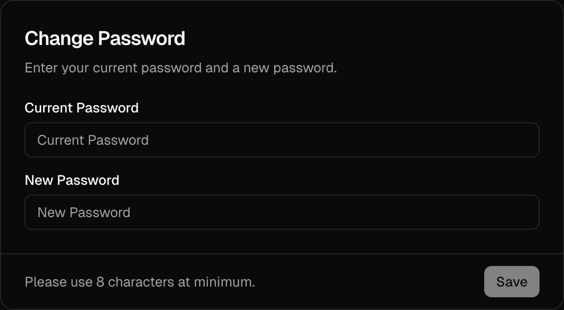
URL: /components/change-password-card
undefined
***
## title:
The `` provides a secure and user-friendly interface for users to update their account passwords, seamlessly integrated with your authentication flow. It supports verification workflows to ensure passwords are securely updated, revoking other active sessions when the password changes.
 ## Usage
Here's how you can include `` in your user account settings page:
```tsx
import { ChangePasswordCard } from "@daveyplate/better-auth-ui"
export default function SettingsPage() {
return (
## Usage
Here's how you can include `` in your user account settings page:
```tsx
import { ChangePasswordCard } from "@daveyplate/better-auth-ui"
export default function SettingsPage() {
return (
)
}
```
This component automatically utilizes the context provided by the [`AuthUIProvider`](/components/auth-ui-provider) and manages password update workflows seamlessly, including revoking other active sessions upon successful password changes.
## Reference
The following props can be utilized to further customize ``:
## Styling
Customize the component styles extensively by providing Tailwind CSS utility classes through the `classNames` prop:
```tsx
```
### Using with linked social accounts (Set Password)
If a user's account was initially created via a social provider without setting a password, the card automatically transforms into a convenient "Set Password" button. Clicking this button triggers sending the user an email with a link to set their password securely.
You don't have to configure anything extra; this behavior is automatic based on your account setup.
***
## Localization
You can easily adjust the displayed texts via the localization prop:
```tsx
```
#
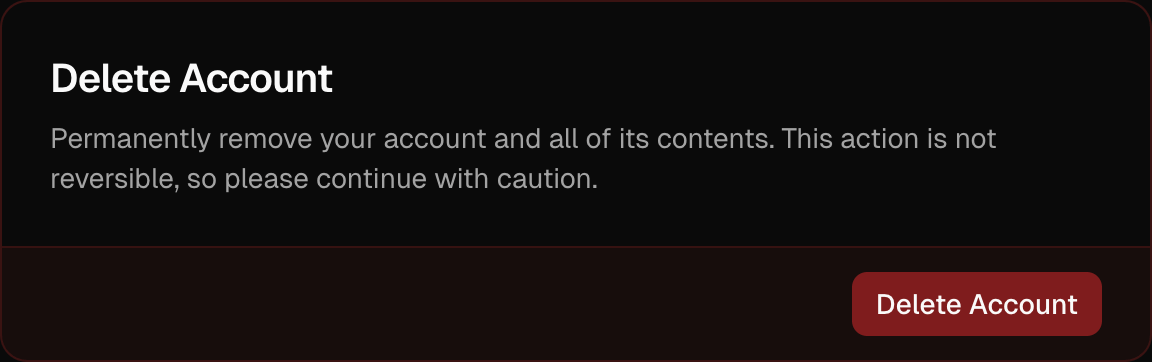
URL: /components/delete-account-card
undefined
***
## title:
The `` component provides users a streamlined UI to delete their account. It supports verification flows, such as password confirmation or email verification, before account deletion.
 ## Usage
Include the `` component on your user settings page:
```tsx
import { DeleteAccountCard } from "@daveyplate/better-auth-ui"
export default function SettingsPage() {
return (
## Usage
Include the `` component on your user settings page:
```tsx
import { DeleteAccountCard } from "@daveyplate/better-auth-ui"
export default function SettingsPage() {
return (
)
}
```
This component leverages the [`AuthUIProvider`](/components/auth-ui-provider) context to handle account deletion (and optional verification) seamlessly.
## Reference
These are the available props for ``:
## Styling
You can customize styling using the provided `classNames` prop with TailwindCSS classes:
```tsx
```
## Localization
Adjust the text within the component for specific requirements or languages:
```tsx
```
#
URL: /components/email-template
undefined
***
## title:
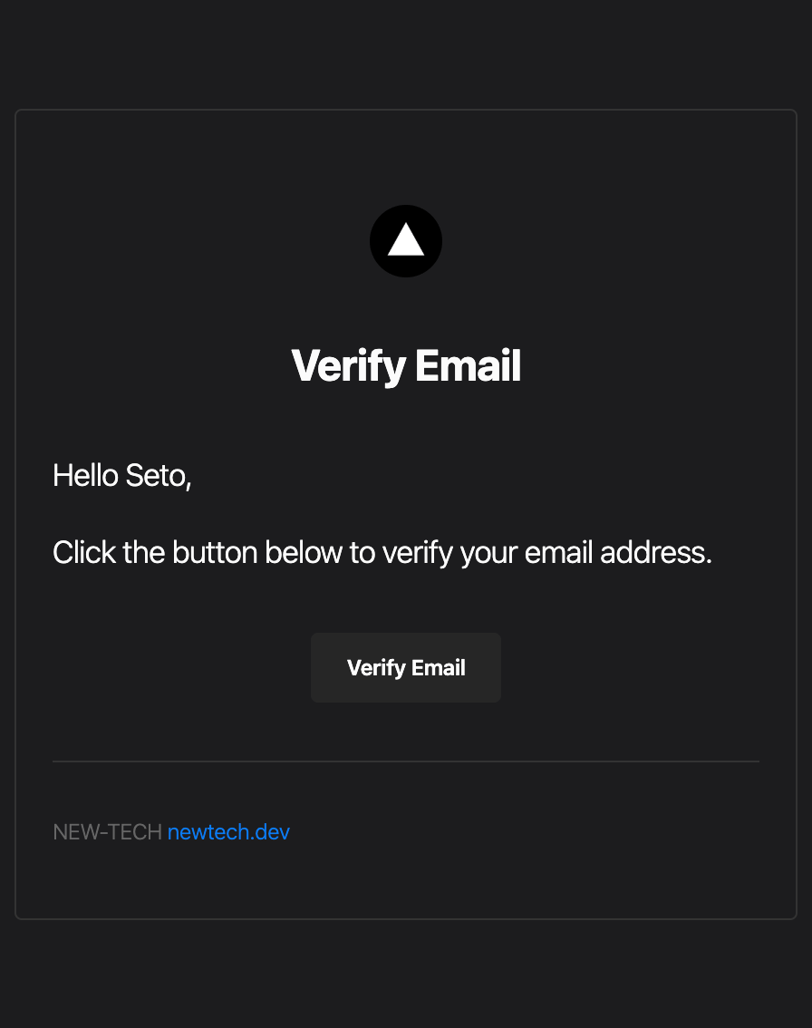
The `` component lets you easily build responsive HTML emails with consistent styling for your authentication flows. It's specifically designed to integrate seamlessly with Better Auth.
 ## Usage
This example demonstrates implementing the email verification notification with the ``:
```tsx title="lib/auth.ts"
import { Resend } from "resend"
import { EmailTemplate } from "@daveyplate/better-auth-ui/server"
const resend = new Resend(process.env.RESEND_API_KEY)
export const auth = betterAuth({
emailAndPassword: {
enabled: true,
requireEmailVerification: true,
},
emailVerification: {
sendVerificationEmail: async ({ user, url, token }, request) => {
const name = user.name || user.email.split("@")[0]
await resend.emails.send({
from: fromEmail,
to: user.email,
subject: "Verify your email address",
react: EmailTemplate({
action: "Verify Email",
content: (
<>
## Usage
This example demonstrates implementing the email verification notification with the ``:
```tsx title="lib/auth.ts"
import { Resend } from "resend"
import { EmailTemplate } from "@daveyplate/better-auth-ui/server"
const resend = new Resend(process.env.RESEND_API_KEY)
export const auth = betterAuth({
emailAndPassword: {
enabled: true,
requireEmailVerification: true,
},
emailVerification: {
sendVerificationEmail: async ({ user, url, token }, request) => {
const name = user.name || user.email.split("@")[0]
await resend.emails.send({
from: fromEmail,
to: user.email,
subject: "Verify your email address",
react: EmailTemplate({
action: "Verify Email",
content: (
<>
{`Hello ${name},`}
Click the button below to verify your email address.
),
heading: "Verify Email",
siteName: "NEW-TECH",
baseUrl: "https://newtech.dev"
url
})
})
},
autoSignInAfterVerification: true,
sendOnSignUp: true
}
})
```
This example demonstrates using the component specifically to send email verification messages. You can easily adapt it to suit other use cases like password reset, magic links, and more, by adjusting the `content`, `action`, and `heading`.
## Reference
The following props can be passed to the `` component:
#
URL: /components/organization-members-card
undefined
***
## title:
The `` component provides a comprehensive interface for managing organization members, including inviting new members, updating roles, and removing members.
## Usage
```tsx
import { OrganizationMembersCard } from '@daveyplate/better-auth-ui'
export function OrganizationMembersPage() {
return (
)
}
```
## Features
* **Member List**: View all organization members with their roles
* **Invite Members**: Send email invitations to new members
* **Role Management**: Update member roles (owner, admin, member, custom)
* **Remove Members**: Remove members from the organization
* **Permission Control**: Actions based on user permissions
## Reference
## Examples
### Basic Usage
```tsx
```
### With Custom Class Names
```tsx
```
### With Custom Localization
```tsx
```
## Member Management Features
### Member Display
Each member shows:
* User avatar and name
* Email address
* Current role
* Actions dropdown (based on permissions)
### Role Hierarchy
1. **Owner**: Full control, can transfer ownership
2. **Admin**: Can manage members and settings
3. **Member**: Basic access
4. **Custom Roles**: Additional roles defined in configuration
### Invite Process
1. Enter email address
2. Select role for new member
3. Send invitation
4. Member receives email with invitation link
5. Member accepts invitation to join
## Permissions
Actions are permission-based:
* **Invite Members**: Requires `invitation:create` permission
* **Update Roles**: Requires `member:update` permission
* **Remove Members**: Requires `member:delete` permission
## Requirements
Enable organization plugin with proper configuration:
```tsx title="providers.tsx"
{children}
```
## Related Components
### Invite Member Dialog
* Email input with validation
* Role selection dropdown
* Send invitation with loading state
### Update Role Dialog
* Current member display
* Role selection
* Update with confirmation
### Remove Member Dialog
* Confirmation prompt
* Member details display
* Remove action with loading state
## Best Practices
1. **Role Assignment**: Assign minimal necessary permissions
2. **Regular Audits**: Review member list periodically
3. **Invitation Expiry**: Set reasonable expiration for invites
4. **Owner Protection**: Prevent accidental owner removal
5. **Clear Labels**: Use descriptive role names
#
URL: /components/organization-settings-cards
undefined
***
## title:
The `` component provides a comprehensive set of cards for managing organization settings, including organization details, logo, and deletion options.
## Usage
```tsx
import { OrganizationSettingsCards } from '@daveyplate/better-auth-ui'
export function OrganizationSettingsPage() {
return (
)
}
```
## Features
* **Organization Logo**: Upload and manage organization logo
* **Organization Name**: Update organization name
* **Organization Slug**: Update organization slug/identifier
* **Delete Organization**: Delete the organization (owner only)
## Reference
## Examples
### Basic Usage
```tsx
```
### With Custom Class Names
```tsx
```
### With Custom Localization
```tsx
```
## Included Cards
### Organization Logo Card
* Upload custom organization logo
* Delete existing logo
* Automatic image resizing and cropping
* Support for custom upload functions
### Organization Name Card
* Update organization display name
* Real-time validation
* Permission-based access control
### Organization Slug Card
* Update organization URL identifier
* Slug format validation (lowercase, hyphens)
* Uniqueness checking
### Delete Organization Card
* Owner-only access
* Confirmation dialog
* Automatic cleanup of related data
## Requirements
The organization plugin must be enabled with proper configuration:
```tsx title="providers.tsx"
{
// Your upload logic
return uploadedUrl
},
delete: async (url) => {
// Optional: clean up your storage/CDN on delete
await myCdn.delete(url)
},
size: 256,
extension: "png"
}
}}
>
{children}
```
## Permissions
* **View Settings**: All organization members
* **Update Name/Slug**: Admin and Owner roles
* **Upload Logo**: Admin and Owner roles
* **Delete Organization**: Owner role only
#
URL: /components/organization-switcher
undefined
***
## title:
The `` is a comprehensive component that provides organization and personal account switching functionality. It displays the currently active organization or personal account and allows users to switch between them, create new organizations, and manage their organization settings.
## Usage
```tsx
import { OrganizationSwitcher } from '@daveyplate/better-auth-ui'
export function Header() {
return (
)
}
```
## Features
* **Organization Selection**: Switch between different organizations
* **Personal Account**: Switch back to personal account
* **Create Organization**: Create new organizations directly from the switcher
* **Organization Settings**: Quick access to organization settings
* **Responsive Design**: Adapts to different screen sizes
* **Custom Trigger**: Use your own trigger element
* **Hide Personal Mode**: Option to enforce organization-only usage
## Reference
## Examples
### Basic Usage
```tsx
```
### With Custom Size
```tsx
```
### With Custom Alignment
```tsx
```
### With Custom Trigger
```tsx
import { Button } from '@/components/ui/button'
Switch Organization
}
/>
```
### With onSetActive Callback
```tsx
{
console.log('Switched to:', organizationId)
}}
/>
```
### With Custom Localization
```tsx
```
### With Custom Class Names
```tsx
```
### Hide Personal Account
For applications that require users to always work within an organization context, you can hide the personal account option:
```tsx
```
When `hidePersonal` is set to `true`:
* The personal account option is removed from the dropdown
* If no organization is active, the first available organization is automatically selected
* Users cannot switch back to their personal account
* The switcher only shows and allows switching between organizations
## Behavior
* **Initial State**: Shows the active organization or personal account
* **Loading State**: Displays skeleton loader while fetching data
* **Empty State**: Shows "Sign In" option when not authenticated
* **Error Handling**: Displays toast notifications for errors
* **Automatic Updates**: Refreshes when organization changes
## Requirements
The `OrganizationSwitcher` requires the organization plugin to be configured in your auth client:
```tsx title="providers.tsx"
{children}
```
#
URL: /components/passkeys-card
Displays and manages user's passkeys/WebAuthn credentials
***
title:
description: Displays and manages user's passkeys/WebAuthn credentials
----------------------------------------------------------------------
## Import
```tsx
import { PasskeysCard } from "@better-auth/ui-react/components"
```
## Usage
```tsx
```
## Props
| Name | Type | Default | Description |
| -------------- | ------------------ | ----------- | ------------------------------------ |
| `className` | `string` | `undefined` | Additional CSS classes for styling |
| `localization` | `AuthLocalization` | `undefined` | Localization object for translations |
## Example
```tsx
import { PasskeysCard } from "@better-auth/ui-react/components"
export function SecuritySettings() {
return (
)
}
```
## Features
* View all registered passkeys
* Add new passkeys
* Delete existing passkeys
* Shows passkey creation date and device info
* Built-in loading states
#
URL: /components/providers-card
undefined
***
## title:
The `` component provides a simple interface for managing linked social providers. It allows users to link or unlink third-party social accounts with a clean, customizable UI out of the box.
**Note:** You must configure the `providers` option in your [`AuthUIProvider`](../components/auth-ui-provider) context to use this component.
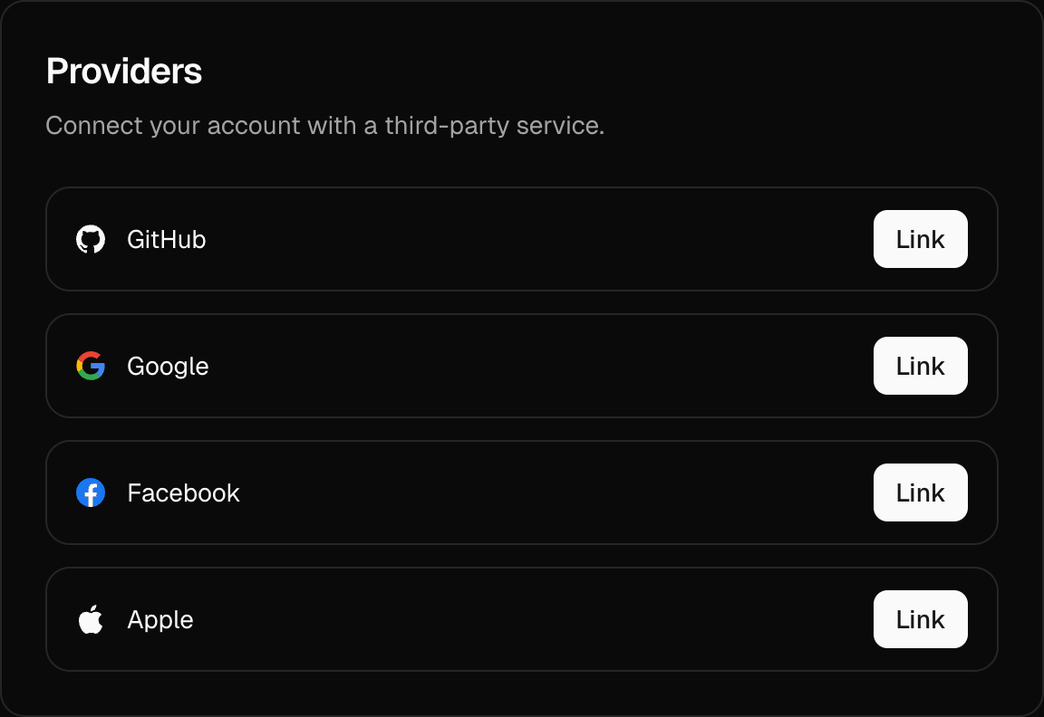
 ## Usage
Here's how you can include `` on your user settings or account management page:
```tsx
import { ProvidersCard } from "@daveyplate/better-auth-ui"
export default function SettingsPage() {
return (
)
}
```
This component seamlessly pulls in settings from your [`AuthUIProvider`](../components/auth-ui-provider) context, automatically handling provider link and unlink workflows.
## Reference
You can use the following props to further customize ``:
## Styling
Customize the styling of your `` through the `classNames` prop:
```tsx
```
## Localization
Adjust displayed texts via the `localization` prop to fit your application's localization:
```tsx
```
## Usage in Settings Page
You usually integrate the `` with other settings components. Here's a typical example configuration:
```tsx title="app/dashboard/settings/page.tsx"
import {
ProvidersCard,
ChangeEmailCard,
SettingsCards,
} from "@daveyplate/better-auth-ui";
export default function SettingsPage() {
return (
)
}
```
This complete implementation shows how you can use `` along with other available settings cards to build a comprehensive, managed user settings experience quickly.
#
URL: /components/redirect-to-sign-in
undefined
***
## title:
The `` component automatically redirects unauthenticated users to the sign-in page. If the user is already authenticated, this component will render nothing and allow the user to view the content normally.
Useful for wrapping pages or routes that require users to be signed in.
## Usage
```tsx
import { RedirectToSignIn, SignedIn } from "@daveyplate/better-auth-ui"
export default function ProtectedPage() {
return (
<>
You can see this content only if you are authenticated.
)
}
```
## Example
Here's a practical example of enforcing authentication for private routes:
```tsx title="PrivateRoute.tsx"
import { RedirectToSignIn, SignedIn } from "@daveyplate/better-auth-ui"
export default function PrivateRoute({ children }: { children: React.ReactNode }) {
return (
<>
{children}
)
}
```
In this example, we're ensuring that the user is redirected to the sign-in page if they are not logged in.
#
URL: /components/redirect-to-sign-up
undefined
***
## title: ""
The `` component ensures users are redirected to the sign-up page if they are not authenticated. If the user is signed in, it does nothing. It's useful for protected pages in your application, specifically when you want unauthenticated users to immediately register instead of logging in.
## Usage
```tsx
import { RedirectToSignUp, SignedIn } from "@daveyplate/better-auth-ui"
export default function ProtectedPage() {
return (
<>
Welcome! You are signed in.
)
}
```
#
URL: /components/security-settings-cards
A collection of security-related settings cards for user account protection
***
title:
description: A collection of security-related settings cards for user account protection
----------------------------------------------------------------------------------------
## Import
```tsx
import { SecuritySettingsCards } from "@daveyplate/better-auth-ui"
```
## Usage
```tsx
```
## Props
| Name | Type | Default | Description |
| -------------- | --------------------------- | ----------- | ---------------------------------------- |
| `className` | `string` | `undefined` | Additional CSS classes for the container |
| `classNames` | `SettingsCardsClassNames` | `undefined` | Class names for individual components |
| `localization` | `Partial` | `undefined` | Localization object for translations |
## Example
```tsx
import { SecuritySettingsCards } from "@daveyplate/better-auth-ui"
export function SecuritySettings() {
return (
## Usage
Here's how you can include `` on your user settings or account management page:
```tsx
import { ProvidersCard } from "@daveyplate/better-auth-ui"
export default function SettingsPage() {
return (
)
}
```
This component seamlessly pulls in settings from your [`AuthUIProvider`](../components/auth-ui-provider) context, automatically handling provider link and unlink workflows.
## Reference
You can use the following props to further customize ``:
## Styling
Customize the styling of your `` through the `classNames` prop:
```tsx
```
## Localization
Adjust displayed texts via the `localization` prop to fit your application's localization:
```tsx
```
## Usage in Settings Page
You usually integrate the `` with other settings components. Here's a typical example configuration:
```tsx title="app/dashboard/settings/page.tsx"
import {
ProvidersCard,
ChangeEmailCard,
SettingsCards,
} from "@daveyplate/better-auth-ui";
export default function SettingsPage() {
return (
)
}
```
This complete implementation shows how you can use `` along with other available settings cards to build a comprehensive, managed user settings experience quickly.
#
URL: /components/redirect-to-sign-in
undefined
***
## title:
The `` component automatically redirects unauthenticated users to the sign-in page. If the user is already authenticated, this component will render nothing and allow the user to view the content normally.
Useful for wrapping pages or routes that require users to be signed in.
## Usage
```tsx
import { RedirectToSignIn, SignedIn } from "@daveyplate/better-auth-ui"
export default function ProtectedPage() {
return (
<>
You can see this content only if you are authenticated.
)
}
```
## Example
Here's a practical example of enforcing authentication for private routes:
```tsx title="PrivateRoute.tsx"
import { RedirectToSignIn, SignedIn } from "@daveyplate/better-auth-ui"
export default function PrivateRoute({ children }: { children: React.ReactNode }) {
return (
<>
{children}
)
}
```
In this example, we're ensuring that the user is redirected to the sign-in page if they are not logged in.
#
URL: /components/redirect-to-sign-up
undefined
***
## title: ""
The `` component ensures users are redirected to the sign-up page if they are not authenticated. If the user is signed in, it does nothing. It's useful for protected pages in your application, specifically when you want unauthenticated users to immediately register instead of logging in.
## Usage
```tsx
import { RedirectToSignUp, SignedIn } from "@daveyplate/better-auth-ui"
export default function ProtectedPage() {
return (
<>
Welcome! You are signed in.
)
}
```
#
URL: /components/security-settings-cards
A collection of security-related settings cards for user account protection
***
title:
description: A collection of security-related settings cards for user account protection
----------------------------------------------------------------------------------------
## Import
```tsx
import { SecuritySettingsCards } from "@daveyplate/better-auth-ui"
```
## Usage
```tsx
```
## Props
| Name | Type | Default | Description |
| -------------- | --------------------------- | ----------- | ---------------------------------------- |
| `className` | `string` | `undefined` | Additional CSS classes for the container |
| `classNames` | `SettingsCardsClassNames` | `undefined` | Class names for individual components |
| `localization` | `Partial` | `undefined` | Localization object for translations |
## Example
```tsx
import { SecuritySettingsCards } from "@daveyplate/better-auth-ui"
export function SecuritySettings() {
return (
Security Settings
)
}
```
## Custom Styling
```tsx
```
## Features
The `SecuritySettingsCards` component automatically renders security-related cards based on your Better Auth configuration:
### Included Cards
* **Change Password Card** - For updating account password (if credentials are enabled)
* **Providers Card** - Manage linked social accounts (if social providers are configured)
* **Two-Factor Authentication Card** - Enable/disable 2FA (if two-factor is enabled and credentials are linked)
* **Passkeys Card** - Manage passkeys for passwordless authentication (if passkeys are enabled)
* **Sessions Card** - View and manage active sessions
* **Delete Account Card** - Allow users to delete their account (if delete user is enabled)
### Conditional Rendering
Cards are conditionally rendered based on:
* Your Better Auth configuration
* User's current authentication state
* Available authentication methods
For example:
* Password card only appears if `credentials` is enabled
* Two-factor card requires both `twoFactor` enabled and a credential-linked account
* Providers card appears if either `social.providers` or `genericOAuth.providers` are configured
## Localization
The component supports full localization through the `localization` prop:
```tsx
```
## Security Considerations
This component handles sensitive security settings. It includes:
* Session freshness checks for critical operations
* Proper authentication state validation
* Secure password change flows
* Safe account deletion with confirmation
## Related Components
* [``](/docs/components/settings-cards) - Parent component with navigation
* [``](/docs/components/change-password-card) - Individual password change card
* [``](/docs/components/two-factor-card) - Two-factor authentication management
* [``](/docs/components/sessions-card) - Active sessions management
* [``](/docs/components/delete-account-card) - Account deletion
#
URL: /components/sessions-card
undefined
***
## title:
The `` component provides users with an intuitive interface for viewing and managing their active authentication sessions. Users can easily revoke active sessions, enhancing security by maintaining control over their account access across multiple devices and browsers.
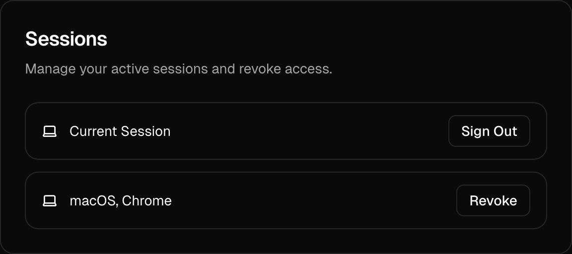
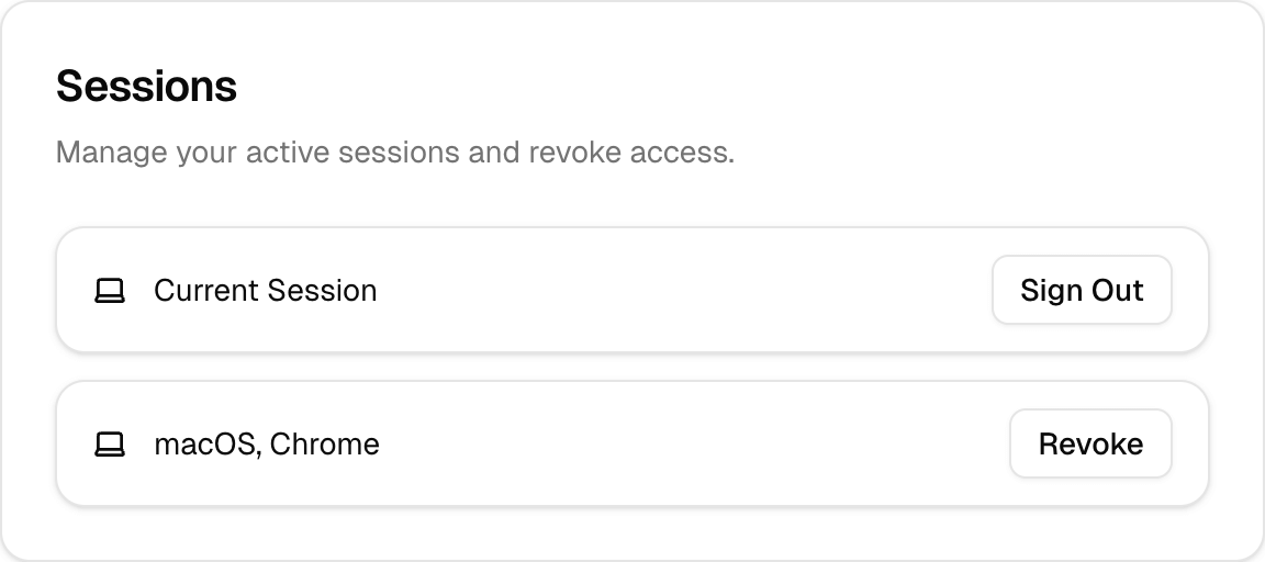 ## Usage
Include the `` component within your account settings page or security settings page:
```tsx
import { SessionsCard } from "@daveyplate/better-auth-ui"
export default function SettingsPage() {
return (
## Usage
Include the `` component within your account settings page or security settings page:
```tsx
import { SessionsCard } from "@daveyplate/better-auth-ui"
export default function SettingsPage() {
return (
)
}
```
## Reference
Below are the available props for customizing ``:
## Styling
You can customize the appearance of `` using Tailwind CSS classes provided via the `classNames` prop:
```tsx
```
## Localization
The text within `` can be customized through the `localization` prop, allowing you to adapt it to different languages or contexts:
```tsx
```
***
#
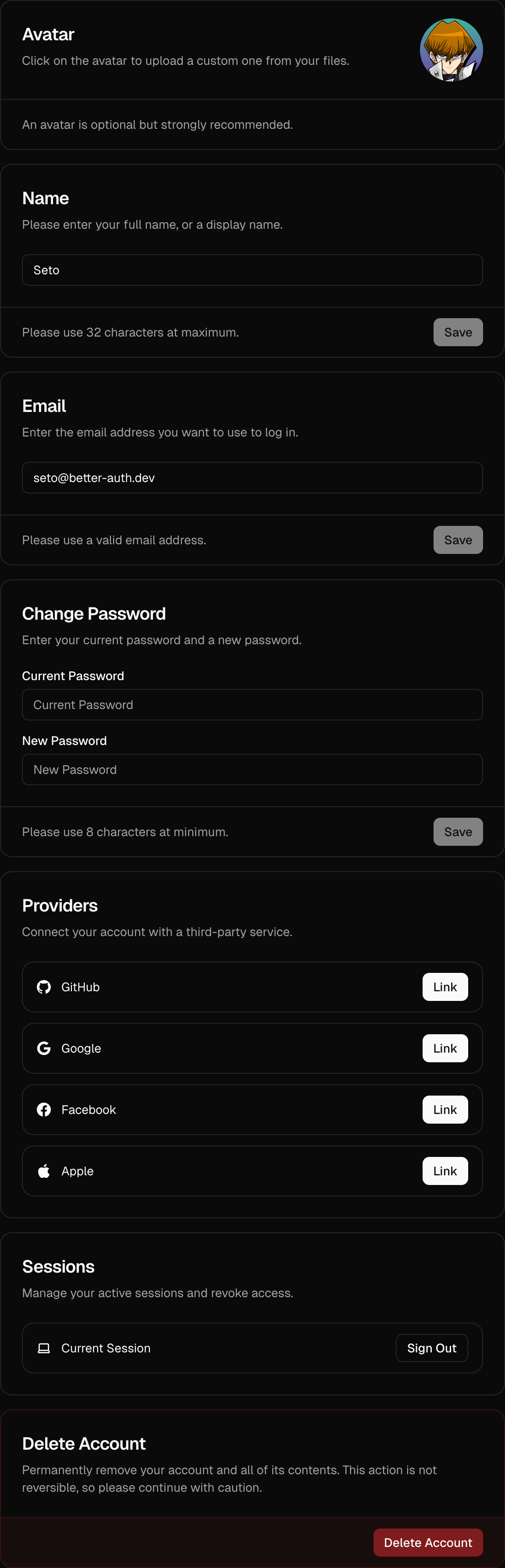
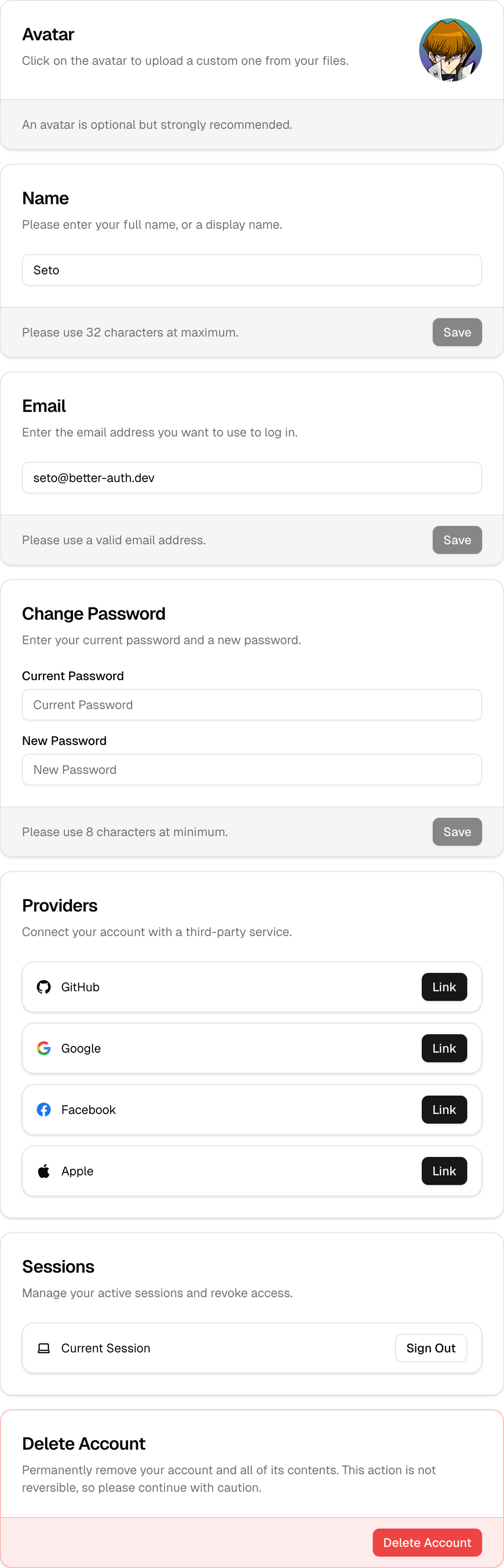
URL: /components/settings-cards
undefined
***
## title:
The `` component provides a convenient plug-and-play UI for managing user account settings. It includes a comprehensive suite of manageable account settings, such as changing passwords and email addresses, updating avatars, managing linked providers, handling active sessions, and more.
This component automatically leverages all the features you have enabled via the [``](/components/auth-ui-provider) and provides a seamless user settings UI out of the box.
 ## Default Settings Page Behavior
By default, the built-in [``](/components/auth-view) component automatically displays `` when the `/auth/settings` route is accessed. If you prefer to handle user settings on a custom route or component, you can override this behavior using the `settings.url` prop.
## Overriding Built-in Settings URL
To use your own custom settings route and avoid using the default included settings card, you can specify the `settings.url` prop within your [``](/components/auth-ui-provider) configuration:
```tsx title="app/providers.tsx"
import { AuthUIProvider } from "@daveyplate/better-auth-ui"
import { authClient } from "@/lib/auth-client"
import { useRouter } from "next/navigation"
import Link from "next/link"
export function Providers({ children }: { children: React.ReactNode }) {
const router = useRouter()
return (
router.refresh()}
settings={{
url: "/dashboard/settings" // Your custom settings page URL
}}
Link={Link}
>
{children}
)
}
```
By setting the `settings.url` as shown above, the built-in `/auth/settings` page will also automatically redirect users to your specified `/dashboard/settings` page.
***
## Using `` on Your Custom Page
You can then easily utilize the provided `` component directly in your custom settings route within your app's layout. Here's how you might set up a properly protected custom settings route in your framework of choice:
```tsx title="app/dashboard/settings/page.tsx"
import { SettingsCards } from "@daveyplate/better-auth-ui"
export default function SettingsPage() {
return (
## Default Settings Page Behavior
By default, the built-in [``](/components/auth-view) component automatically displays `` when the `/auth/settings` route is accessed. If you prefer to handle user settings on a custom route or component, you can override this behavior using the `settings.url` prop.
## Overriding Built-in Settings URL
To use your own custom settings route and avoid using the default included settings card, you can specify the `settings.url` prop within your [``](/components/auth-ui-provider) configuration:
```tsx title="app/providers.tsx"
import { AuthUIProvider } from "@daveyplate/better-auth-ui"
import { authClient } from "@/lib/auth-client"
import { useRouter } from "next/navigation"
import Link from "next/link"
export function Providers({ children }: { children: React.ReactNode }) {
const router = useRouter()
return (
router.refresh()}
settings={{
url: "/dashboard/settings" // Your custom settings page URL
}}
Link={Link}
>
{children}
)
}
```
By setting the `settings.url` as shown above, the built-in `/auth/settings` page will also automatically redirect users to your specified `/dashboard/settings` page.
***
## Using `` on Your Custom Page
You can then easily utilize the provided `` component directly in your custom settings route within your app's layout. Here's how you might set up a properly protected custom settings route in your framework of choice:
```tsx title="app/dashboard/settings/page.tsx"
import { SettingsCards } from "@daveyplate/better-auth-ui"
export default function SettingsPage() {
return (
)
}
```
This will provide users a customizable, fully-styled settings experience without requiring you to create all components yourself.
***
## Customization Options
You can customize the UI extensively by passing TailwindCSS classes or customizing provided class names through the `classNames` prop.
### Customizing Styles with classNames
Using Tailwind utility classes, you can fully customize all card states. Here's an example to illustrate significant styling customization:
```tsx
```
### All available settings included in SettingsCards:
* **Avatar** (optional, requires avatar upload configured in AuthUIProvider)
* **Name**
* **Email**
* **Username** (requires username plugin)
* **Password** (optional, requires credentials to be enabled)
* **Connected Providers** (if enabled)
* **Active Sessions**
* **Delete Account** (optional, requires account deletion configuration)
#### Custom Additional Fields
The `` also supports displaying any custom `additionalFields` you've provided via the `settings.fields` prop of the ``:
```tsx title="app/providers.tsx"
{children}
```
These fields appear alongside the existing provided setting cards automatically.
***
#
URL: /components/signed-in
undefined
***
## title:
The `` component conditionally renders its child components based on whether a user is authenticated.
Use it to display content only visible to logged-in users.
## Usage
Basic usage example:
```tsx
import { SignedIn } from "@daveyplate/better-auth-ui"
export default function UserDashboard() {
return (
Only signed-in users will see this!
)
}
```
## Example
Here's an example demonstrating `` in a practical scenario:
```tsx
import { SignedIn, SignedOut, UserButton } from "@daveyplate/better-auth-ui"
export default function Navbar() {
return (
)
}
```
In this example, the [``](/components/user-button) component is displayed only if the user has an active session. Otherwise, visitors are prompted with a sign-in link.
#
URL: /components/signed-out
undefined
***
## title:
The `` component conditionally renders its children only when the user is not authenticated. It is a simple helper for handling UI components or pages that should only be accessible by guests (unauthenticated users).
Use this component to conditionally hide or show content based on the user's authentication status.
## Usage
Wrap any content that should be displayed only to signed-out (unauthenticated) users within the `` component:
```tsx
import { SignedOut } from "@daveyplate/better-auth-ui"
export default function Example() {
return (
You need to log in to access this feature.
)
}
```
## Example
A practical view managing authentication states using both [``](/components/signed-in) and `` components together:
```tsx
import { SignedIn, SignedOut, UserButton } from "@daveyplate/better-auth-ui"
export default function Navbar() {
return (
)
}
```
#
URL: /components/two-factor-card
undefined
***
## title:
The `` provides a secure interface for managing two-factor authentication (2FA), allowing users to enable or disable 2FA with password confirmation. It handles the complete setup flow including QR code scanning and backup codes generation.
## Usage
Here's how you can include `` in your settings page:
```tsx
import { TwoFactorCard } from "@daveyplate/better-auth-ui"
export default function SettingsPage() {
return (
)
}
```
## Styling
Customize the component appearance using Tailwind CSS classes through the `classNames` prop:
```tsx
```
#
URL: /components/update-avatar-card
undefined
***
## title:
The `` component is a pre-built UI element for users to easily manage and update their avatar image. It seamlessly integrates with the [`AuthUIProvider`](../components/auth-ui-provider) and utilizes either a custom or built-in avatar upload implementation.
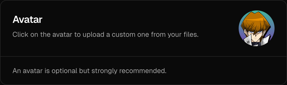
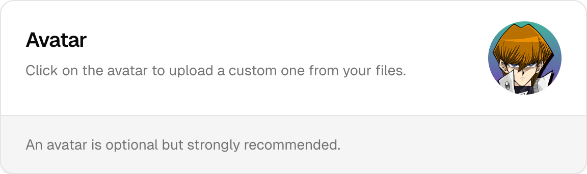 ## Usage
Here's how to include the `` component within your custom settings page. If you don't provide an `avatar.upload` function, the component will store the avatar image as a base64 string in database.
```tsx
import { UpdateAvatarCard } from "@daveyplate/better-auth-ui"
export default function CustomSettings() {
return (
## Usage
Here's how to include the `` component within your custom settings page. If you don't provide an `avatar.upload` function, the component will store the avatar image as a base64 string in database.
```tsx
import { UpdateAvatarCard } from "@daveyplate/better-auth-ui"
export default function CustomSettings() {
return (
)
}
```
You can optionally provide `avatar.upload` prop within your [`AuthUIProvider`](../components/auth-ui-provider). You can also provide an optional `avatar.delete` function that will be called when the user deletes their avatar so you can clean up your storage/CDN:
```tsx title="providers.tsx"
"use client"
import { AuthUIProvider } from "@daveyplate/better-auth-ui"
import { authClient } from "@/lib/auth-client"
import { useRouter } from "next/navigation"
import Link from "next/link"
export const Providers = ({ children }: { children: React.ReactNode }) => {
const router = useRouter()
return (
router.refresh()}
avatar={{
upload: async (file: File) => {
const formData = new FormData()
formData.append("avatar", file)
const res = await fetch("/api/uploadAvatar", {
method: "POST",
body: formData,
})
const { data } = await res.json()
return data.url
},
delete: async (url: string) => {
await fetch("/api/deleteAvatar", {
method: "POST",
headers: { "Content-Type": "application/json" },
body: JSON.stringify({ url })
})
}
}}
Link={Link}
>
{children}
)
}
```
## Reference
These are the available props for ``:
## Styling
The `classNames` prop is useful for customizing inner elements using Tailwind classes:
```tsx
```
## Notes
Avatars are auto-cropped, optimized, and resized before uploading:
* **Cropping**: The image is automatically center-cropped into a square.
* **Sizing**: Default `avatar.size` is set to:
* `128px` (when using built-in storage - base64)
* `256px` (when using custom `avatar.upload`)
* **File Format**: You can customize the uploaded image file format via `avatar.extension` prop in [`AuthUIProvider`](../components/auth-ui-provider). It defaults to `"png"`.
#
URL: /components/update-field-card
Generic settings card for updating custom user fields
***
title:
description: Generic settings card for updating custom user fields
------------------------------------------------------------------
## Import
```tsx
import { UpdateFieldCard } from "@better-auth/ui-react/components"
```
## Usage
```tsx
```
## Props
| Name | Type | Default | Description |
| -------------- | ------------------------------------------------ | ----------- | ------------------------------------------ |
| `name` | `string` | (required) | Field name in the user object |
| `label` | `ReactNode` | `undefined` | Display label for the field |
| `type` | `"text" \| "number" \| "boolean"` | `"text"` | Input type for the field |
| `value` | `unknown` | `undefined` | Current field value |
| `placeholder` | `string` | `undefined` | Input placeholder text |
| `required` | `boolean` | `false` | Whether the field is required |
| `description` | `ReactNode` | `undefined` | Description text shown below the title |
| `instructions` | `ReactNode` | `undefined` | Additional instructions shown in the card |
| `validate` | `(value: string) => boolean \| Promise` | `undefined` | Custom validation function |
| `className` | `string` | `undefined` | Additional CSS classes for styling |
| `classNames` | `SettingsCardClassNames` | `undefined` | Class names for individual card components |
| `localization` | `Partial` | `undefined` | Localization object for translations |
## Examples
### Text Field
```tsx
```
### Number Field
```tsx
Number(value) >= 18}
/>
```
### Boolean Field
```tsx
```
## Features
* Supports text, number, and boolean field types
* Built-in form validation
* Custom validation support
* Success/error feedback
* Loading states during update
* Checkbox UI for boolean fields
* Integrated with Better Auth additional fields
#
URL: /components/update-name-card
Settings card for updating user's display name
***
title:
description: Settings card for updating user's display name
-----------------------------------------------------------
## Import
```tsx
import { UpdateNameCard } from "@better-auth/ui-react/components"
```
## Usage
```tsx
```
## Props
| Name | Type | Default | Description |
| -------------- | ------------------ | ----------- | ------------------------------------ |
| `className` | `string` | `undefined` | Additional CSS classes for styling |
| `localization` | `AuthLocalization` | `undefined` | Localization object for translations |
## Example
```tsx
import { UpdateNameCard } from "@better-auth/ui-react/components"
export function AccountSettings() {
return (
)
}
```
## Features
* Update user's display name
* Built-in form validation
* Success/error feedback
* Loading states during update
* Integrated with Better Auth session management
#
URL: /components/update-username-card
undefined
***
## title:
The `` component provides a simple, intuitive UI that enables users to update their account username within the authentication system. This component automatically integrates with the [`AuthUIProvider`](/components/auth-ui-provider) context, leveraging the username configuration set by your authentication framework.
## Usage
Include the `` in your custom settings or profile page:
```tsx
import { UpdateUsernameCard } from "@daveyplate/better-auth-ui"
export default function CustomSettings() {
return (
)
}
```
## Reference
These are the available props for ``:
## Styling
The styles can be customized precisely with Tailwind classes via the `classNames` prop:
```tsx
```
# useAuthenticate()
URL: /components/use-authenticate
undefined
***
## title: useAuthenticate()
The `useAuthenticate()` hook automatically redirects unauthenticated users to the sign-in page. If the user is already authenticated, this hook does nothing and allows the user to view the content normally.
This is a hook alternative to the `` component, useful for redirecting users programmatically.
## Usage
```tsx
import { useAuthenticate } from "@daveyplate/better-auth-ui"
export default function ProtectedPage() {
// Will redirect to sign-in if user is not authenticated
useAuthenticate()
return Protected content visible only to authenticated users
}
```
## Options
The hook accepts an options object with the following properties:
```tsx
interface AuthenticateOptions {
authView?: "signIn" | "signUp" // Default: "signIn"
enabled?: boolean // Default: true
}
```
* `authView`: The authentication view to redirect to. Can be either "signIn" or "signUp".
* `enabled`: Whether the authentication check is enabled. When set to `false`, no redirection will occur.
## Example with Options
```tsx
import { useAuthenticate } from "@daveyplate/better-auth-ui"
export default function ProtectedSignUpPage() {
// Will redirect to sign-up instead of sign-in if user is not authenticated
useAuthenticate({
authView: "signUp",
})
return Protected content
}
```
## Disabling the Redirect
You can conditionally disable the redirection with the `enabled` option:
```tsx
import { useAuthenticate } from "@daveyplate/better-auth-ui"
export default function ConditionalProtectedPage({ isProtected }: { isProtected: boolean }) {
// Only redirect if isProtected is true
useAuthenticate({
enabled: isProtected
})
return This content may or may not be protected
}
```
#
URL: /components/user-avatar
undefined
***
## title:
The `` component renders a user's avatar image based on the provided user object. If the user does not have an avatar image, a fallback with the first 2 letters of their name or email will be displayed.
## Usage
```tsx
import { UserAvatar } from "@daveyplate/better-auth-ui"
export default function Example() {
const user = {
name: "Seto",
email: "seto@better-auth.dev",
image: "https://better-auth-ui.com/avatars/seto.png"
}
return
}
```
## Reference
The following props can be passed to the `` component:
## Example
Here is a practical example demonstrating customized styles and fallback customization:
```tsx
import { UserAvatar } from "@daveyplate/better-auth-ui"
export default function Example() {
const user = {
name: "Seto",
email: "seto@better-auth.dev",
image: "https://better-auth-ui.com/avatars/seto.png"
}
return (
)
}
```
#
URL: /components/user-button
undefined
***
## title:
The `` component provides an easy-to-use dropdown menu button that displays user account information and session management actions. It includes an avatar, provides quick access to user settings, linked accounts, and session management actions.

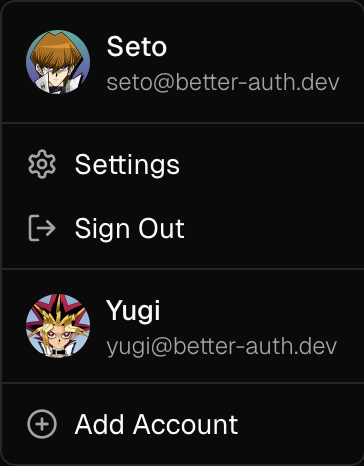
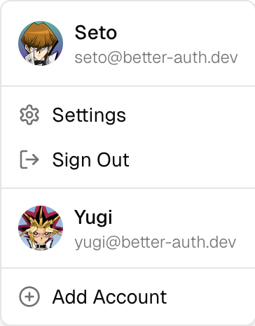 ## Usage
```tsx
import { UserButton } from "@daveyplate/better-auth-ui";
export default function Example() {
return ;
}
```
## Reference
These are the available props for the `` component:
## Examples
### Icon Size Button
The `size="icon"` prop turns the UserButton into a small button, showing only the user's avatar. This is the default size.
```tsx
import { UserButton } from "@daveyplate/better-auth-ui";
export default function Example() {
return (
)
}
```
### Full Width Button
The `size="full"` prop turns the UserButton into a wide button, showing the user's avatar, name or email, and dropdown arrow. Recommended for desktop user menus.
## Usage
```tsx
import { UserButton } from "@daveyplate/better-auth-ui";
export default function Example() {
return ;
}
```
## Reference
These are the available props for the `` component:
## Examples
### Icon Size Button
The `size="icon"` prop turns the UserButton into a small button, showing only the user's avatar. This is the default size.
```tsx
import { UserButton } from "@daveyplate/better-auth-ui";
export default function Example() {
return (
)
}
```
### Full Width Button
The `size="full"` prop turns the UserButton into a wide button, showing the user's avatar, name or email, and dropdown arrow. Recommended for desktop user menus.

 ```tsx
import { UserButton } from "@daveyplate/better-auth-ui";
export default function Example() {
return
}
```
### Styling
You can fully customize the appearance of the UserButton component with [`UserButtonClassNames`](/api-reference/user-button-class-names) using the `classNames` prop.
Here's an example that drastically customizes the styling:
```tsx
import { UserButton } from "@daveyplate/better-auth-ui";
export default function Example() {
return
}
```
### Styling
You can fully customize the appearance of the UserButton component with [`UserButtonClassNames`](/api-reference/user-button-class-names) using the `classNames` prop.
Here's an example that drastically customizes the styling:

 ```tsx
import { UserButton } from "@daveyplate/better-auth-ui";
export default function Example() {
return (
)
}
```
# InstantDB
URL: /data/instantdb
undefined
***
title: InstantDB
icon: "InstantDB"
-----------------
[InstantDB](https://instantdb.com/) is a simple and powerful database solution that works well with Better Auth UI.
## Prerequisites
Set up your project with the [@daveyplate/better-auth-instantdb](https://github.com/daveyplate/better-auth-instantdb) package.
## Integration with Auth UI Providers
You can pass the InstantDB hooks and mutators to both the `AuthUIProvider` and `AuthUIProviderTanstack` components:
```tsx
import { useInstantAuth } from "@daveyplate/better-auth-instantdb"
import { useInstantOptions } from "@daveyplate/better-auth-ui/instantdb"
import { AuthUIProvider } from "@daveyplate/better-auth-ui"
import { useSession } from "@/lib/auth-client"
import { db } from "@/lib/db"
function Providers({ children }) {
const { data: sessionData, isPending } = useSession()
useInstantAuth({ db, sessionData, isPending })
const { user } = db.useAuth()
const { hooks, mutators } = useInstantOptions({
db,
sessionData,
isPending,
user,
usePlural: true
})
return (
{children}
)
}
```
The same pattern works for `AuthUIProviderTanstack` as well. This is the recommended for use with a Persist Client for offline authentication.
# TanStack Query
URL: /data/tanstack-query
undefined
***
title: TanStack Query
icon: "ReactQuery"
------------------
In order to use `@daveyplate/better-auth-ui` with the [`@daveyplate/better-auth-tanstack`](https://github.com/daveyplate/better-auth-tanstack) package, all you need to do is change your [``](/components/auth-ui-provider) into an `` component. It accepts all of the same props and configuration options.
The main difference is the `persistClient` prop which is only required if you are using a [`persistQueryClient`](https://tanstack.com/query/latest/docs/framework/react/plugins/persistQueryClient) for offline Authentication. This prop will tell the authentication methods to use the `/auth/callback` path for all authentication methods that leave the site, which will clear your query cache for you automatically.
```tsx title="app/providers.tsx"
"use client"
import { AuthUIProviderTanstack } from "@daveyplate/better-auth-ui/tanstack"
import { AuthQueryProvider } from "@daveyplate/better-auth-tanstack"
import Link from "next/link"
import { useRouter } from "next/navigation"
import { authClient } from "@/lib/auth-client"
export function Providers({ children }: { children: React.ReactNode }) {
const router = useRouter()
return (
router.refresh()}
Link={Link}
>
{children}
)
}
```
# Triplit
URL: /data/triplit
undefined
***
title: Triplit
icon: "Triplit"
---------------
[Triplit](https://triplit.dev/) is a simple and powerful database solution that works well with Better Auth UI.
## Prerequisites
Set up your project with the [@daveyplate/better-auth-triplit](https://github.com/daveyplate/better-auth-triplit) package.
## Integration with Auth UI Providers
You can pass the Triplit hooks to both the `AuthUIProvider` and `AuthUIProviderTanstack` components:
```tsx
import { useTriplitHooks } from "@daveyplate/better-auth-ui/triplit"
import { AuthUIProvider } from "@daveyplate/better-auth-ui"
import { useSession } from "@/lib/auth-client"
import { triplit } from "@/lib/triplit"
function Providers({ children }) {
const { data: sessionData, isPending } = useSession()
const { hooks } = useTriplitHooks({
triplit,
sessionData,
isPending,
usePlural: true
})
return (
{children}
)
}
```
The same pattern works for `AuthUIProviderTanstack` as well. This is recommended for use with a Persist Client for offline authentication.
# Installation
URL: /getting-started/installation
undefined
***
title: Installation
icon: Download
--------------
import { Step, Steps } from 'fumadocs-ui/components/steps';
Follow the steps below to install the `@daveyplate/better-auth-ui` library.
## Install the Package
Install the `@daveyplate/better-auth-ui` library using your preferred package manager.
```package-install
@daveyplate/better-auth-ui@latest
```
## TailwindCSS Configuration
For [TailwindCSS](https://tailwindcss.com) `v4`, add the following `@import` to your global css:
```css title="styles/globals.css"
@import "@daveyplate/better-auth-ui/css";
```
For [TailwindCSS](https://tailwindcss.com) `v3` *(Deprecated)*, add the following `content` to your Tailwind config:
```ts
content: [
"./node_modules/@daveyplate/better-auth-ui/dist/**/*.{js,ts,jsx,tsx,mdx}"
]
```
## Integrations
Now that you've installed `@daveyplate/better-auth-ui`, follow one of the guides below to integrate it with your preferred framework:
```tsx
import { UserButton } from "@daveyplate/better-auth-ui";
export default function Example() {
return (
)
}
```
# InstantDB
URL: /data/instantdb
undefined
***
title: InstantDB
icon: "InstantDB"
-----------------
[InstantDB](https://instantdb.com/) is a simple and powerful database solution that works well with Better Auth UI.
## Prerequisites
Set up your project with the [@daveyplate/better-auth-instantdb](https://github.com/daveyplate/better-auth-instantdb) package.
## Integration with Auth UI Providers
You can pass the InstantDB hooks and mutators to both the `AuthUIProvider` and `AuthUIProviderTanstack` components:
```tsx
import { useInstantAuth } from "@daveyplate/better-auth-instantdb"
import { useInstantOptions } from "@daveyplate/better-auth-ui/instantdb"
import { AuthUIProvider } from "@daveyplate/better-auth-ui"
import { useSession } from "@/lib/auth-client"
import { db } from "@/lib/db"
function Providers({ children }) {
const { data: sessionData, isPending } = useSession()
useInstantAuth({ db, sessionData, isPending })
const { user } = db.useAuth()
const { hooks, mutators } = useInstantOptions({
db,
sessionData,
isPending,
user,
usePlural: true
})
return (
{children}
)
}
```
The same pattern works for `AuthUIProviderTanstack` as well. This is the recommended for use with a Persist Client for offline authentication.
# TanStack Query
URL: /data/tanstack-query
undefined
***
title: TanStack Query
icon: "ReactQuery"
------------------
In order to use `@daveyplate/better-auth-ui` with the [`@daveyplate/better-auth-tanstack`](https://github.com/daveyplate/better-auth-tanstack) package, all you need to do is change your [``](/components/auth-ui-provider) into an `` component. It accepts all of the same props and configuration options.
The main difference is the `persistClient` prop which is only required if you are using a [`persistQueryClient`](https://tanstack.com/query/latest/docs/framework/react/plugins/persistQueryClient) for offline Authentication. This prop will tell the authentication methods to use the `/auth/callback` path for all authentication methods that leave the site, which will clear your query cache for you automatically.
```tsx title="app/providers.tsx"
"use client"
import { AuthUIProviderTanstack } from "@daveyplate/better-auth-ui/tanstack"
import { AuthQueryProvider } from "@daveyplate/better-auth-tanstack"
import Link from "next/link"
import { useRouter } from "next/navigation"
import { authClient } from "@/lib/auth-client"
export function Providers({ children }: { children: React.ReactNode }) {
const router = useRouter()
return (
router.refresh()}
Link={Link}
>
{children}
)
}
```
# Triplit
URL: /data/triplit
undefined
***
title: Triplit
icon: "Triplit"
---------------
[Triplit](https://triplit.dev/) is a simple and powerful database solution that works well with Better Auth UI.
## Prerequisites
Set up your project with the [@daveyplate/better-auth-triplit](https://github.com/daveyplate/better-auth-triplit) package.
## Integration with Auth UI Providers
You can pass the Triplit hooks to both the `AuthUIProvider` and `AuthUIProviderTanstack` components:
```tsx
import { useTriplitHooks } from "@daveyplate/better-auth-ui/triplit"
import { AuthUIProvider } from "@daveyplate/better-auth-ui"
import { useSession } from "@/lib/auth-client"
import { triplit } from "@/lib/triplit"
function Providers({ children }) {
const { data: sessionData, isPending } = useSession()
const { hooks } = useTriplitHooks({
triplit,
sessionData,
isPending,
usePlural: true
})
return (
{children}
)
}
```
The same pattern works for `AuthUIProviderTanstack` as well. This is recommended for use with a Persist Client for offline authentication.
# Installation
URL: /getting-started/installation
undefined
***
title: Installation
icon: Download
--------------
import { Step, Steps } from 'fumadocs-ui/components/steps';
Follow the steps below to install the `@daveyplate/better-auth-ui` library.
## Install the Package
Install the `@daveyplate/better-auth-ui` library using your preferred package manager.
```package-install
@daveyplate/better-auth-ui@latest
```
## TailwindCSS Configuration
For [TailwindCSS](https://tailwindcss.com) `v4`, add the following `@import` to your global css:
```css title="styles/globals.css"
@import "@daveyplate/better-auth-ui/css";
```
For [TailwindCSS](https://tailwindcss.com) `v3` *(Deprecated)*, add the following `content` to your Tailwind config:
```ts
content: [
"./node_modules/@daveyplate/better-auth-ui/dist/**/*.{js,ts,jsx,tsx,mdx}"
]
```
## Integrations
Now that you've installed `@daveyplate/better-auth-ui`, follow one of the guides below to integrate it with your preferred framework:
Next.js
TanStack Start
React
{/*
Vite
Laravel
React Router
Astro
Gatsby
Manual
*/}
# Requirements
URL: /getting-started/requirements
undefined
***
title: Requirements
icon: PackageCheck
------------------
In order to use `@daveyplate/better-auth-ui`, your application must meet the following requirements.
## Prerequisites
* You must have [shadcn/ui](https://ui.shadcn.com) installed with CSS variables enabled.
* Configure a [Sonner](https://ui.shadcn.com/docs/components/sonner) `` component for toast notifications.
* Ensure you have [TailwindCSS](https://tailwindcss.com) `v4` set up and configured correctly.
* You must have [better-auth](https://better-auth.com) `v1.3` or greater installed and configured.
# Next.js
URL: /integrations/next-js
undefined
***
title: Next.js
icon: NextJs
------------
import { Step, Steps } from "fumadocs-ui/components/steps";
This guide covers integrating `@daveyplate/better-auth-ui` into your Next.js project.
## Starter Project
Want to skip the installation? Check out the starter here:
* App Router: [GitHub](https://github.com/daveyplate/better-auth-nextjs-starter) - [Demo](https://nextjs.better-auth-starter.com)
* Pages Router: [GitHub](https://github.com/daveyplate/better-auth-nextjs-pages-starter) - [Demo](https://nextjs-pages.better-auth-starter.com)
## App Router
Follow these steps to set up `@daveyplate/better-auth-ui` in your [Next.js](https://nextjs.org) project using the **App Router**:
### AuthUIProvider
The first step is to set up the [``](/components/auth-ui-provider) client component with your [`authClient`](https://www.better-auth.com/docs/installation#create-client-instance), wrapping your layout. This is required to provide the context & hooks to your authentication components across your application.
```tsx title="app/providers.tsx"
"use client"
import { AuthUIProvider } from "@daveyplate/better-auth-ui"
import Link from "next/link"
import { useRouter } from "next/navigation"
import type { ReactNode } from "react"
import { authClient } from "@/lib/auth-client"
export function Providers({ children }: { children: ReactNode }) {
const router = useRouter()
return (
{
// Clear router cache (protected routes)
router.refresh()
}}
Link={Link}
>
{children}
)
}
```
**Note**: Since the Next.js **App Router** caches routes by default, navigation to protected routes may fail until you perform a `router.refresh()` to clear the cache. To prevent this issue, you must use `router.refresh()` in the provided `onSessionChange` callback. This forces Next.js to clear the router cache and reload middleware-protected content, ensuring subsequent navigations accurately reflect the current auth state.
Once configured, wrap your layout component with the `Providers` component:
```tsx title="app/layout.tsx"
import type { ReactNode } from "react"
import { Providers } from "./providers"
export default function RootLayout({ children }: { children: ReactNode }) {
return (
{children}
)
}
```
The [``](/components/auth-ui-provider) can be fully customized with plugins, styles, localization and more. For more information and all available props, see the [``](/components/auth-ui-provider) component documentation.
### Auth Pages
Create a dynamic route segment for authentication views in `app/auth/[authView]/page.tsx`.
```tsx title="app/auth/[path]/page.tsx"
import { AuthView } from "@daveyplate/better-auth-ui"
import { authViewPaths } from "@daveyplate/better-auth-ui/server"
export const dynamicParams = false
export function generateStaticParams() {
return Object.values(authViewPaths).map((path) => ({ path }))
}
export default async function AuthPage({ params }: { params: Promise<{ path: string }> }) {
const { path } = await params
return (
)
}
```
The newly created dynamic route covers the following paths by default:
* `/auth/sign-in` – Sign in via email/password and social providers
* `/auth/sign-up` – New account registration
* `/auth/magic-link` – Email login without a password
* `/auth/forgot-password` – Trigger email to reset forgotten password
* `/auth/two-factor` – Two-factor authentication
* `/auth/recover-account` – Recover account via backup code
* `/auth/reset-password` – Set new password after receiving reset link
* `/auth/sign-out` – Log the user out of the application
* `/auth/callback` – Internal route to handle Auth callbacks
* `/auth/accept-invitation` – Accept an invitation to an organization
Ensure that any links to the authentication process utilize these routes accordingly. All routes will render the `` component and automatically handle navigation and authentication flow.
### Account Pages
```tsx title="app/account/[path]/page.tsx"
import { AccountView } from "@daveyplate/better-auth-ui"
import { accountViewPaths } from "@daveyplate/better-auth-ui/server"
export const dynamicParams = false
export function generateStaticParams() {
return Object.values(accountViewPaths).map((path) => ({ path }))
}
export default async function AccountPage({ params }: { params: Promise<{ path: string }> }) {
const { path } = await params
return (
)
}
```
### Organization Pages
```tsx title="app/organization/[path]/page.tsx"
import { OrganizationView } from "@daveyplate/better-auth-ui"
import { organizationViewPaths } from "@daveyplate/better-auth-ui/server"
export const dynamicParams = false
export function generateStaticParams() {
return Object.values(organizationViewPaths).map((path) => ({ path }))
}
export default async function OrganizationPage({ params }: { params: Promise<{ path: string }> }) {
const { path } = await params
return (
)
}
```
If you prefer slug-based org URLs, set `organization={{ pathMode: "slug", basePath: "/organization", slug: currentSlug }}` in the `AuthUIProvider` and structure your routes accordingly:
```tsx title="app/organization/[slug]/[path]/page.tsx"
import { OrganizationView } from "@daveyplate/better-auth-ui"
import { organizationViewPaths } from "@daveyplate/better-auth-ui/server"
export default async function OrganizationPage({ params }: { params: Promise<{ path: string }> }) {
const { path } = await params
return (
)
}
```
## Pages Router
Follow these steps to set up `@daveyplate/better-auth-ui` in your [Next.js](https://nextjs.org) project using the **Pages Router**:
### AuthUIProvider
First set up the [``](/components/auth-ui-provider) within your custom App component in `_app.tsx`.
```tsx title="pages/_app.tsx"
import type { AppProps } from "next/app"
import { AuthUIProvider } from "@daveyplate/better-auth-ui"
import { useRouter } from "next/router"
import Link from "next/link"
import { authClient } from "@/lib/auth-client"
export default function App({ Component, pageProps }: AppProps) {
const router = useRouter()
return (
)
}
```
Now the authentication context is available across your entire application.
### Auth Pages
Create a page with a dynamic segment in your Pages directory in `pages/auth/[authView].tsx`
```tsx title="pages/auth/[path].tsx"
import { AuthView } from "@daveyplate/better-auth-ui"
import { authViewPaths } from "@daveyplate/better-auth-ui/server"
export default function AuthPage({ path }: { path: string }) {
return (
)
}
export async function getStaticPaths() {
return {
paths: Object.values(authViewPaths).map((path) => ({ params: { path } })),
fallback: false
}
}
export async function getStaticProps({ params }: { params: { path: string } }) {
return { props: { path: params.path } }
}
```
These routes match the list shown in the App Router section above.
### Account Pages
```tsx title="pages/account/[path].tsx"
import { AccountView } from "@daveyplate/better-auth-ui"
import { accountViewPaths } from "@daveyplate/better-auth-ui/server"
export default function AccountPage({ path }: { path: string }) {
return (
)
}
export async function getStaticPaths() {
return {
paths: Object.values(accountViewPaths).map((path) => ({ params: { path } })),
fallback: false
}
}
export async function getStaticProps({ params }: { params: { path: string } }) {
return { props: { path: params.path } }
}
```
### Organization Pages
```tsx title="pages/organization/[path].tsx"
import { OrganizationView } from "@daveyplate/better-auth-ui"
import { organizationViewPaths } from "@daveyplate/better-auth-ui/server"
export default function OrganizationPage({ path }: { path: string }) {
return (
)
}
export async function getStaticPaths() {
return {
paths: Object.values(organizationViewPaths).map((path) => ({ params: { path } })),
fallback: false
}
}
export async function getStaticProps({ params }: { params: { path: string } }) {
return { props: { organizationView: params.path } }
}
```
# React
URL: /integrations/react
undefined
***
title: React
icon: React
-----------
import { Step, Steps } from 'fumadocs-ui/components/steps';
This guide covers integrating `@daveyplate/better-auth-ui` into your React project.
## Setting up AuthUIProvider
First, set up [``](/components/auth-ui-provider) as it provides context and hooks required by all subsequent authentication components. Create a top-level provider to encapsulate your app:
```tsx title="src/providers.tsx"
import { AuthUIProvider } from "@daveyplate/better-auth-ui"
import { authClient } from "@/lib/auth-client"
import { useNavigate, NavLink } from "react-router-dom"
export function Providers({ children }: { children: React.ReactNode }) {
const navigate = useNavigate()
return (
{children}
)
}
```
Wrap your root component with the newly created Providers component in your main app entry point, typically in `src/main.tsx` or `src/index.tsx`.
```tsx title="src/main.tsx"
import ReactDOM from "react-dom/client"
import App from "./App.tsx"
import { BrowserRouter } from "react-router-dom"
import { Providers } from "./Providers"
ReactDOM.createRoot(document.getElementById("root")!).render(
)
```
## Creating Auth Pages
Configure routes to render [``](/components/auth-ui-provider) for authentication views using React Router.
Create a dynamic authentication route such as `auth/[pathname].tsx` inside your `src` directory. Here's a recommended setup:
```tsx title="src/pages/auth/AuthPage.tsx"
import { useParams } from "react-router-dom"
import { AuthCard } from "@daveyplate/better-auth-ui"
export default function AuthPage() {
const { pathname } = useParams()
return (
)
}
```
Use React Router to configure these dynamic authentication routes:
```tsx title="src/App.tsx"
import { Routes, Route } from "react-router-dom"
import AuthPage from "./pages/auth/AuthPage"
function App() {
return (
} />
)
}
```
The dynamic segment `[pathname]` covers the following default authentication views:
* `/auth/sign-in` – Sign in via email, password, social providers, or passkey (WebAuthn)
* `/auth/sign-up` – New account registration, with additional fields supported
* `/auth/magic-link` – Email login without password
* `/auth/forgot-password` – Trigger password reset email
* `/auth/reset-password` – Allow users to reset forgotten passwords
* `/auth/sign-out` – Log out action
* `/auth/settings` – User account management page (authentication required)
* `/auth/callback` – Internal OAuth/Auth callback handler (do not use directly)
Your authentication flow is now completely set up and supporting full customization capabilities.
# TanStack Start
URL: /integrations/tanstack-start
undefined
***
title: TanStack Start
icon: TreePalm
--------------
import { Step, Steps } from "fumadocs-ui/components/steps";
This guide covers integrating `@daveyplate/better-auth-ui` v3 with TanStack Start. We also install [@daveyplate/better-auth-tanstack](https://github.com/daveyplate/better-auth-tanstack) to handle the authentication state and queries.
## Starter Project
Want to skip the installation? Check out the starter here:
[GitHub](https://github.com/daveyplate/better-auth-tanstack-starter) - [Demo](https://tanstack.better-auth-starter.com)
## Installation
### Set up the Auth Provider
TanStack Start requires setting up providers slightly differently than a standard React application. Create a root-level provider component:
```tsx title="app/providers.tsx"
import { AuthQueryProvider } from "@daveyplate/better-auth-tanstack"
import { AuthUIProviderTanstack } from "@daveyplate/better-auth-ui/tanstack"
import { Link, useRouter } from "@tanstack/react-router"
import { QueryClient, QueryClientProvider } from "@tanstack/react-query"
import type { ReactNode } from "react"
import { authClient } from "./lib/auth-client"
// Create a client
const queryClient = new QueryClient({
defaultOptions: {
queries: {
staleTime: 1000 * 60
}
}
})
export function Providers({ children }: { children: ReactNode }) {
const router = useRouter()
return (
router.navigate({ href })}
replace={(href) => router.navigate({ href, replace: true })}
Link={({ href, ...props }) => }
>
{children}
)
}
```
Note how we use TanStack Router's `useRouter` hook and `Link` component to handle navigation.
### Configure the Root Route
Update your root route to use the Providers component:
```tsx title="app/routes/__root.tsx"
import { HeadContent, Outlet, Scripts, createRootRoute } from "@tanstack/react-router"
import type { ReactNode } from "react"
import { Header } from "@/components/header"
import globalsCss from "@/styles/globals.css?url"
import { Providers } from "../providers"
export const Route = createRootRoute({
head: () => ({
meta: [
{
charSet: "utf-8"
},
{
name: "viewport",
content: "width=device-width, initial-scale=1"
},
{
title: "Better Auth TanStack Starter"
}
],
links: [
{ rel: "stylesheet", href: globalsCss },
{ rel: "icon", href: "/favicon.ico" },
{ rel: "apple-touch-icon", href: "/apple-touch-icon.png" },
{ rel: "manifest", href: "/manifest.webmanifest" }
]
}),
component: RootComponent
})
function RootComponent() {
return (
)
}
function RootDocument({ children }: Readonly<{ children: ReactNode }>) {
return (
{children}
)
}
```
## Setting Up Routes
TanStack Start uses a file-based routing system. Here's how to set up your authentication, account, and organization routes using the new v3 containers.
### Auth Pages
Create the following route for authentication views:
```tsx title="app/routes/auth/$authView.tsx"
import { cn } from "@/lib/utils"
import { AuthView } from "@daveyplate/better-auth-ui"
import { createFileRoute } from "@tanstack/react-router"
export const Route = createFileRoute("/auth/$authView")({
component: RouteComponent
})
function RouteComponent() {
const { authView } = Route.useParams()
return (
Powered by{" "}
better-auth.
)
}
```
This dynamic route covers all authentication paths, such as `sign-in`, `sign-up`, `magic-link`, `forgot-password`, `two-factor`, `recover-account`, `reset-password`, `sign-out`, and the internal `callback`.
### Account Pages
Create a dynamic route for account settings using the `AccountView` container (defaults to the `/account` base path):
```tsx title="app/routes/account/$accountView.tsx"
import { AccountView } from "@daveyplate/better-auth-ui"
import { createFileRoute } from "@tanstack/react-router"
export const Route = createFileRoute("/account/$accountView")({
component: RouteComponent
})
function RouteComponent() {
const { accountView } = Route.useParams()
return (
)
}
```
You can customize the base path via the provider using `account={{ basePath: "/account" }}` if needed.
### Organization Pages
Create a dynamic route for organization settings using the `OrganizationView` container (defaults to the `/organization` base path):
```tsx title="app/routes/organization/$organizationView.tsx"
import { OrganizationView } from "@daveyplate/better-auth-ui"
import { createFileRoute } from "@tanstack/react-router"
export const Route = createFileRoute("/organization/$organizationView")({
component: RouteComponent
})
function RouteComponent() {
const { organizationView } = Route.useParams()
return (
)
}
```
If you prefer slug-based org URLs, set `organization={{ pathMode: "slug", basePath: "/organization", slug: currentSlug }}` in the provider and structure your routes accordingly:
```tsx title="app/routes/organization/$slug/$organizationView.tsx"
import { OrganizationView } from "@daveyplate/better-auth-ui"
import { createFileRoute } from "@tanstack/react-router"
export const Route = createFileRoute("/organization/$slug/$organizationView")({
component: RouteComponent
})
function RouteComponent() {
const { organizationView } = Route.useParams()
return (
)
}
```
This setup provides a solid foundation for integrating Better Auth UI v3 with TanStack Start. You'll get all the benefits of TanStack's powerful routing system along with Better Auth UI's new container-based authentication and settings experiences.