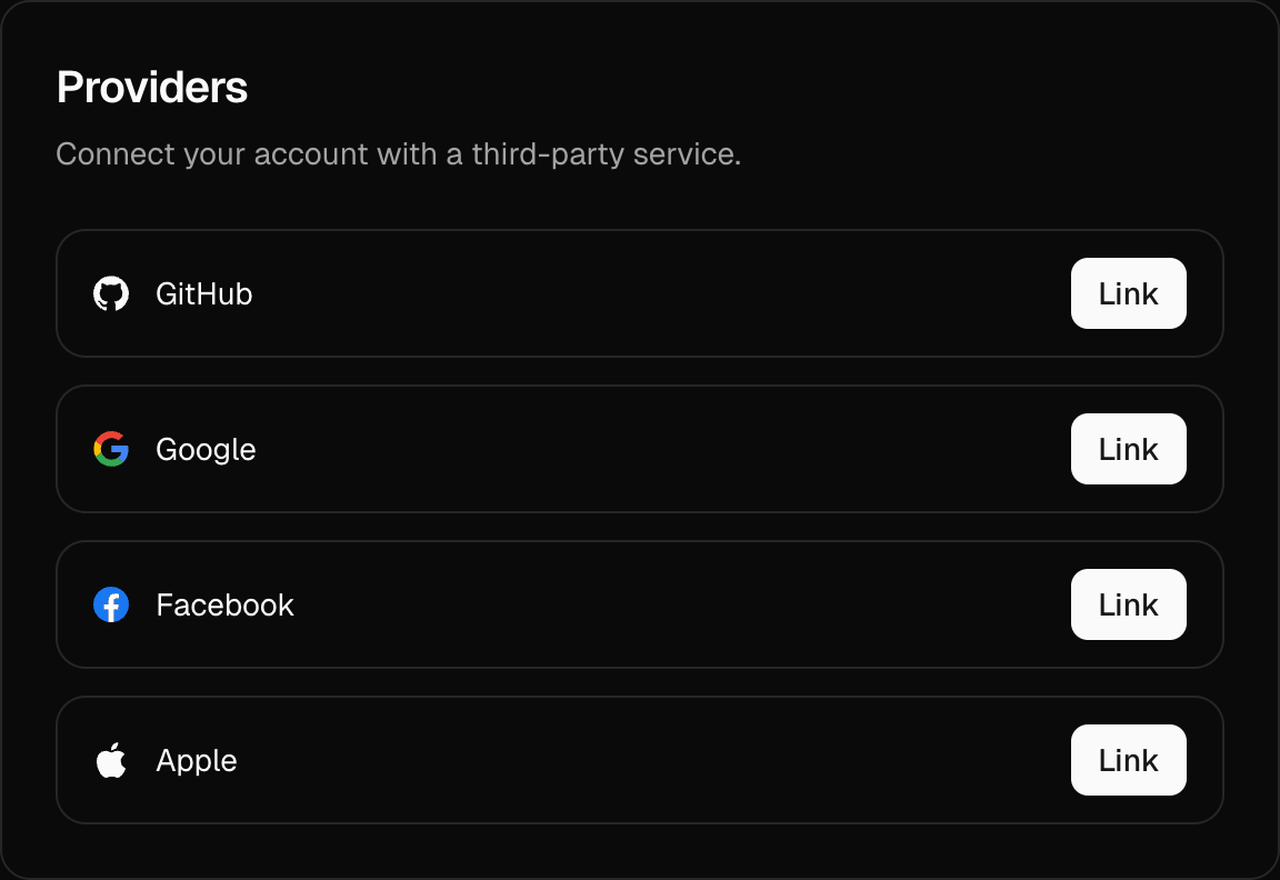
<ProvidersCard />
The <ProvidersCard /> component provides a simple interface for managing linked social providers. It allows users to link or unlink third-party social accounts with a clean, customizable UI out of the box.
Note: You must configure the providers option in your AuthUIProvider context to use this component.
Usage
Here's how you can include <ProvidersCard /> on your user settings or account management page:
import { ProvidersCard } from "@daveyplate/better-auth-ui"

export default function SettingsPage() {
    return (
        <div className="flex flex-col gap-6">
            <ProvidersCard />
        </div>
    )
}
This component seamlessly pulls in settings from your AuthUIProvider context, automatically handling provider link and unlink workflows.
Reference
You can use the following props to further customize <ProvidersCard />:
| Prop | Type | Default |
|---|---|---|
refetch? | Refetch | - |
skipHook? | boolean | - |
localization? | Partial<Partial<{ INVALID_USERNAME_OR_PASSWORD: string; EMAIL_NOT_VERIFIED: string; UNEXPECTED_ERROR: string; USERNAME_IS_ALREADY_TAKEN: string; USERNAME_TOO_SHORT: string; USERNAME_TOO_LONG: string; ... 410 more ...; UNKNOWN: string; }>> | - |
isPending? | boolean | - |
accounts? | Account[] | null | - |
classNames? | SettingsCardClassNames | - |
className? | string | - |
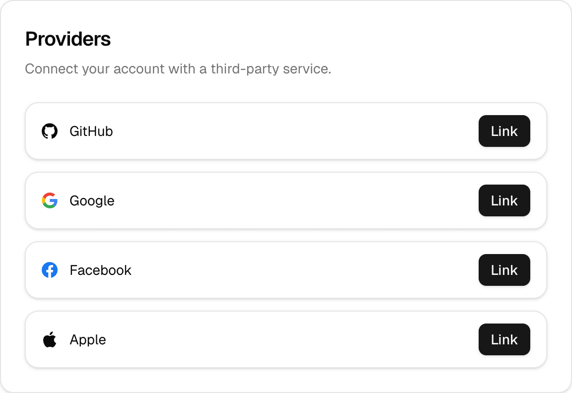
Styling
Customize the styling of your <ProvidersCard /> through the classNames prop:
<ProvidersCard
    classNames={{
        base: "border-primary shadow",
        header: "bg-primary-foreground",
        title: "text-xl font-semibold text-primary",
        description: "text-muted-foreground",
        content: "bg-background",
        footer: "bg-muted",
        button: "bg-primary hover:bg-primary-foreground text-white"
    }}
/>
Localization
Adjust displayed texts via the localization prop to fit your application's localization:
<ProvidersCard
    localization={{
        PROVIDERS: "Social Accounts",
        PROVIDERS_DESCRIPTION: "Link or unlink your third-party social accounts.",
        LINK: "Link Account",
        UNLINK: "Unlink",
    }}
/>
Usage in Settings Page
You usually integrate the <ProvidersCard /> with other settings components. Here's a typical example configuration:
import {
    ProvidersCard,
    ChangeEmailCard,
    SettingsCards,
} from "@daveyplate/better-auth-ui";

export default function SettingsPage() {
    return (
        <div className="flex flex-col gap-6 mx-auto max-w-xl">
            <UpdateAvatarCard />
            <UpdateUsernameCard />
            <ChangeEmailCard />
            <ChangePasswordCard />
            <ProvidersCard />
            <SessionsCard />
            <DeleteAccountCard />
        </div>
    )
}
This complete implementation shows how you can use <ProvidersCard /> along with other available settings cards to build a comprehensive, managed user settings experience quickly.