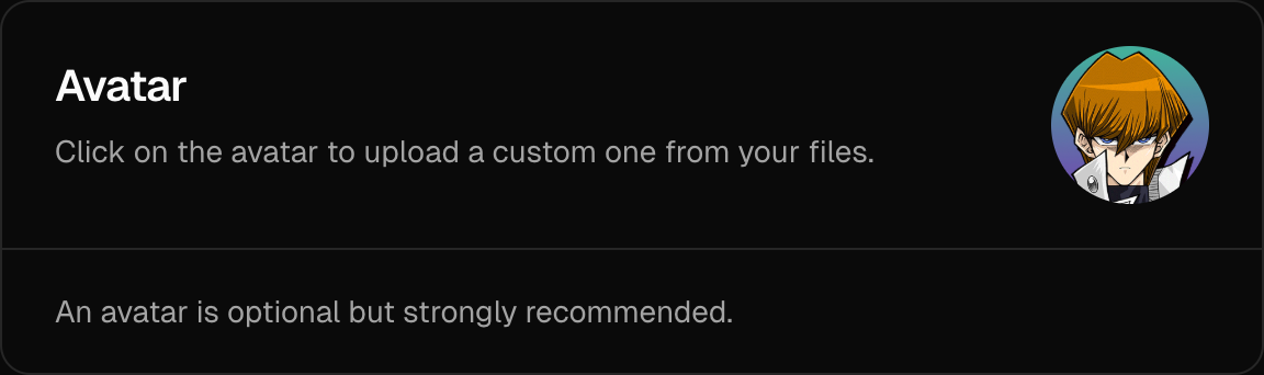
<UpdateAvatarCard />
The <UpdateAvatarCard /> component is a pre-built UI element for users to easily manage and update their avatar image. It seamlessly integrates with the AuthUIProvider and utilizes either a custom or built-in avatar upload implementation.
Usage
Here's how to include the <UpdateAvatarCard /> component within your custom settings page. If you don't provide an avatar.upload function, the component will store the avatar image as a base64 string in database.
import { UpdateAvatarCard } from "@daveyplate/better-auth-ui"

export default function CustomSettings() {
    return (
        <div className="flex flex-col gap-6">
            <UpdateAvatarCard />
        </div>
    )
}
You can optionally provide avatar.upload prop within your AuthUIProvider. You can also provide an optional avatar.delete function that will be called when the user deletes their avatar so you can clean up your storage/CDN:
"use client"

import { AuthUIProvider } from "@daveyplate/better-auth-ui"
import { authClient } from "@/lib/auth-client"
import { useRouter } from "next/navigation"
import Link from "next/link"

export const Providers = ({ children }: { children: React.ReactNode }) => {
    const router = useRouter()

    return (
        <AuthUIProvider
            authClient={authClient}
            navigate={router.push}
            replace={router.replace}
            onSessionChange={() => router.refresh()}
            avatar={{
                upload: async (file: File) => {
                    const formData = new FormData()
                    formData.append("avatar", file)

                    const res = await fetch("/api/uploadAvatar", {
                        method: "POST",
                        body: formData,
                    })

                    const { data } = await res.json()
                    return data.url
                },
                delete: async (url: string) => {
                    await fetch("/api/deleteAvatar", {
                        method: "POST",
                        headers: { "Content-Type": "application/json" },
                        body: JSON.stringify({ url })
                    })
                }
            }}
            Link={Link}
        >
            {children}
        </AuthUIProvider>
    )
}
Reference
These are the available props for <UpdateAvatarCard />:
| Prop | Type | Default |
|---|---|---|
localization? | Partial<{ INVALID_USERNAME_OR_PASSWORD: string; EMAIL_NOT_VERIFIED: string; UNEXPECTED_ERROR: string; USERNAME_IS_ALREADY_TAKEN: string; USERNAME_TOO_SHORT: string; USERNAME_TOO_LONG: string; ... 410 more ...; UNKNOWN: string; }> | - |
classNames? | SettingsCardClassNames | - |
className? | string | - |
Styling
The classNames prop is useful for customizing inner elements using Tailwind classes:
<UpdateAvatarCard
    classNames={{
        base: "border-blue-500",
        avatar: {
            base: "border-4 border-blue-400",
            fallback: "bg-blue-400 text-white"
        },
        footer: "bg-blue-50"
    }}
/>
Notes
Avatars are auto-cropped, optimized, and resized before uploading:
- Cropping: The image is automatically center-cropped into a square.
- Sizing: Default
avatar.sizeis set to:128px(when using built-in storage - base64)256px(when using customavatar.upload)
- File Format: You can customize the uploaded image file format via
avatar.extensionprop inAuthUIProvider. It defaults to"png".